A connected experience across physical and digital: a smart period calendar and companion app, designed together. Cycle tracking as a calmer, more educational daily ritual, anchored to a beautiful object, not a phone notification.
Period tracking is dominated by apps that feel like data-entry chores: stereotyped pink interfaces, daily symptom checklists, and notifications that get ignored. They track the period, but they rarely help women understand what is happening to their bodies, and they are easy to forget.
"I keep forgetting to input my period, and even when I do, I forget to check the app."— Survey participant · Edinburgh, 2024
The research split across five methods, each chosen to answer a different question: why women track, what they want a tracker to do, and how a smart device could fit into their daily lives without feeling like another chore.
HCI research on menstrual self-tracking, feminist design for the changing body, and the gap between user identity and existing app personas.
One on what "woman-centred design" actually means; one with plasticine to find forms that feel calm, trustworthy, and intuitive.
A medical perspective on what to track and what AI should never do. A research perspective on visualising bodily data.
Survey posters placed in campus toilets to ensure private completion. Three sections covering tracking habits, app feedback, and product wishes.
An open box in the exhibition area asking what women would and would not want from an AI menstrual assistant.
"AI for understanding, not diagnosis. Doctors stay the doctors."— Synthesised from gynaecologist interview & AI probe (33 responses)
Six moments. Three on the device, three on the app. The hand-off between them is the design.
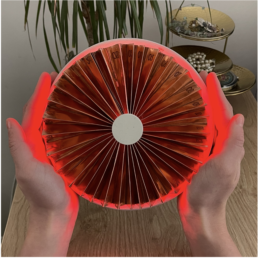
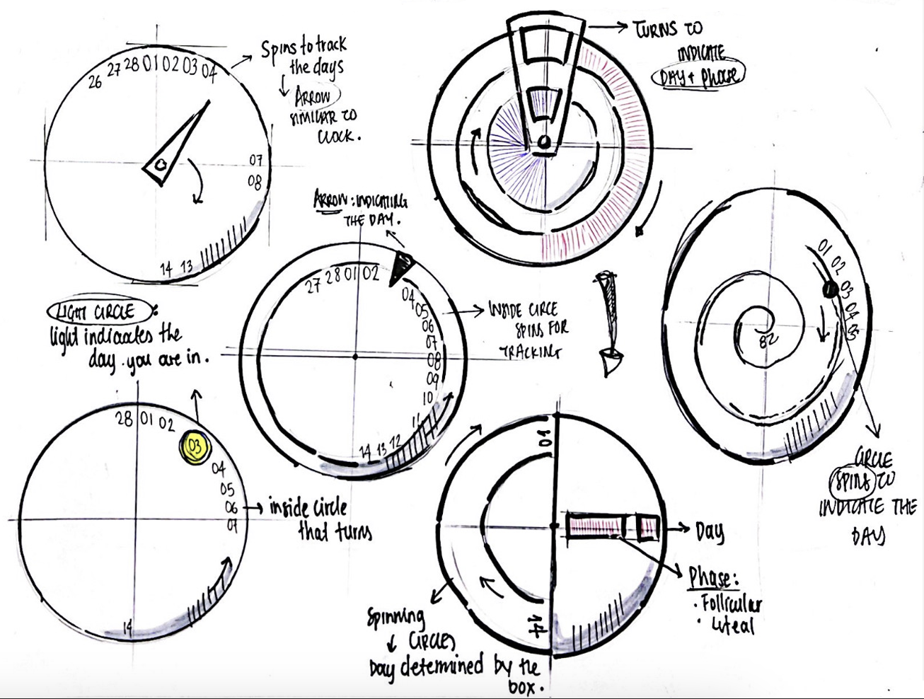
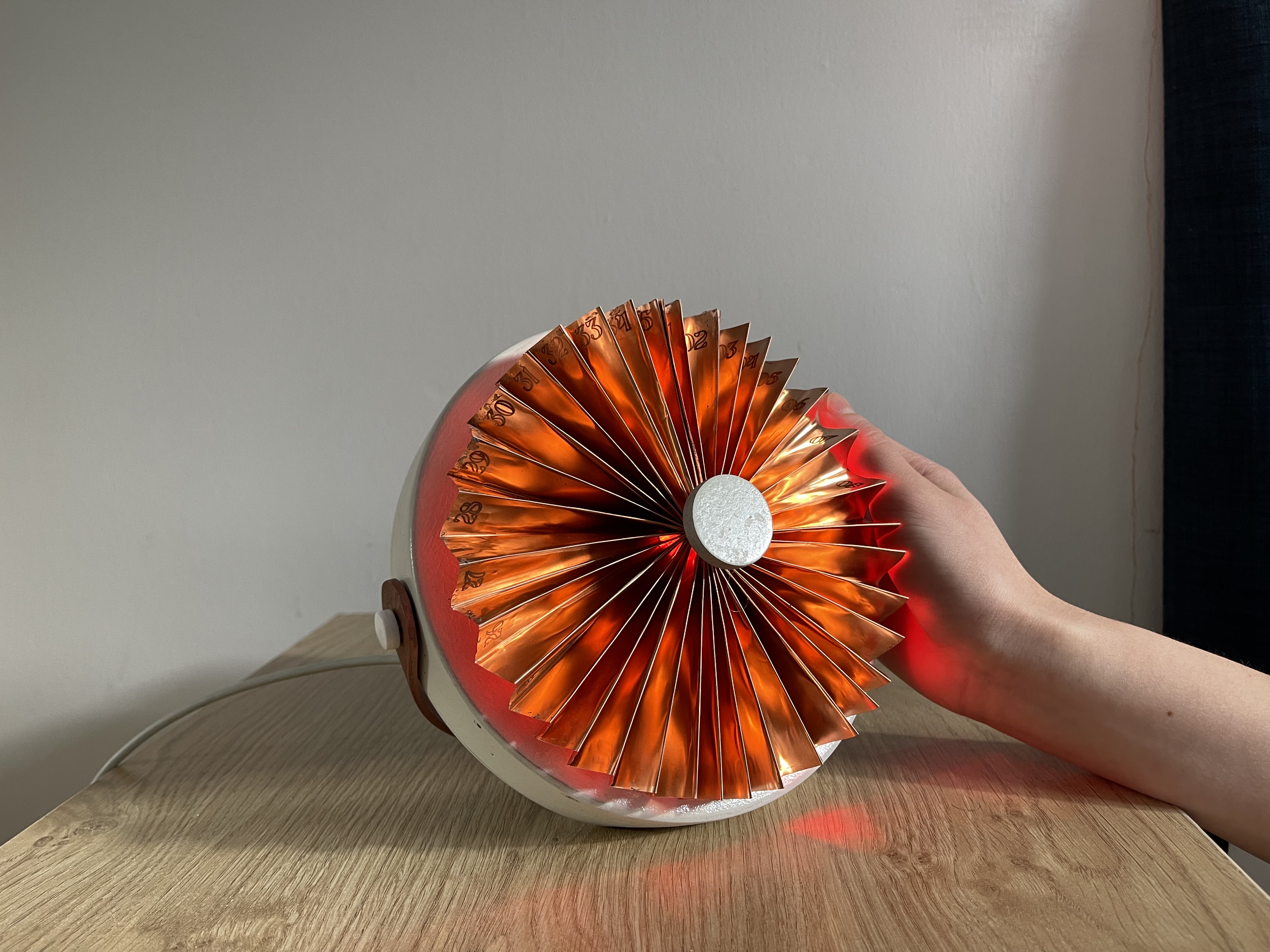
Colour shifts daily. Readable across the room.
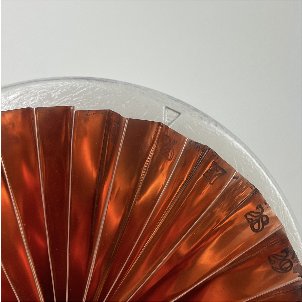
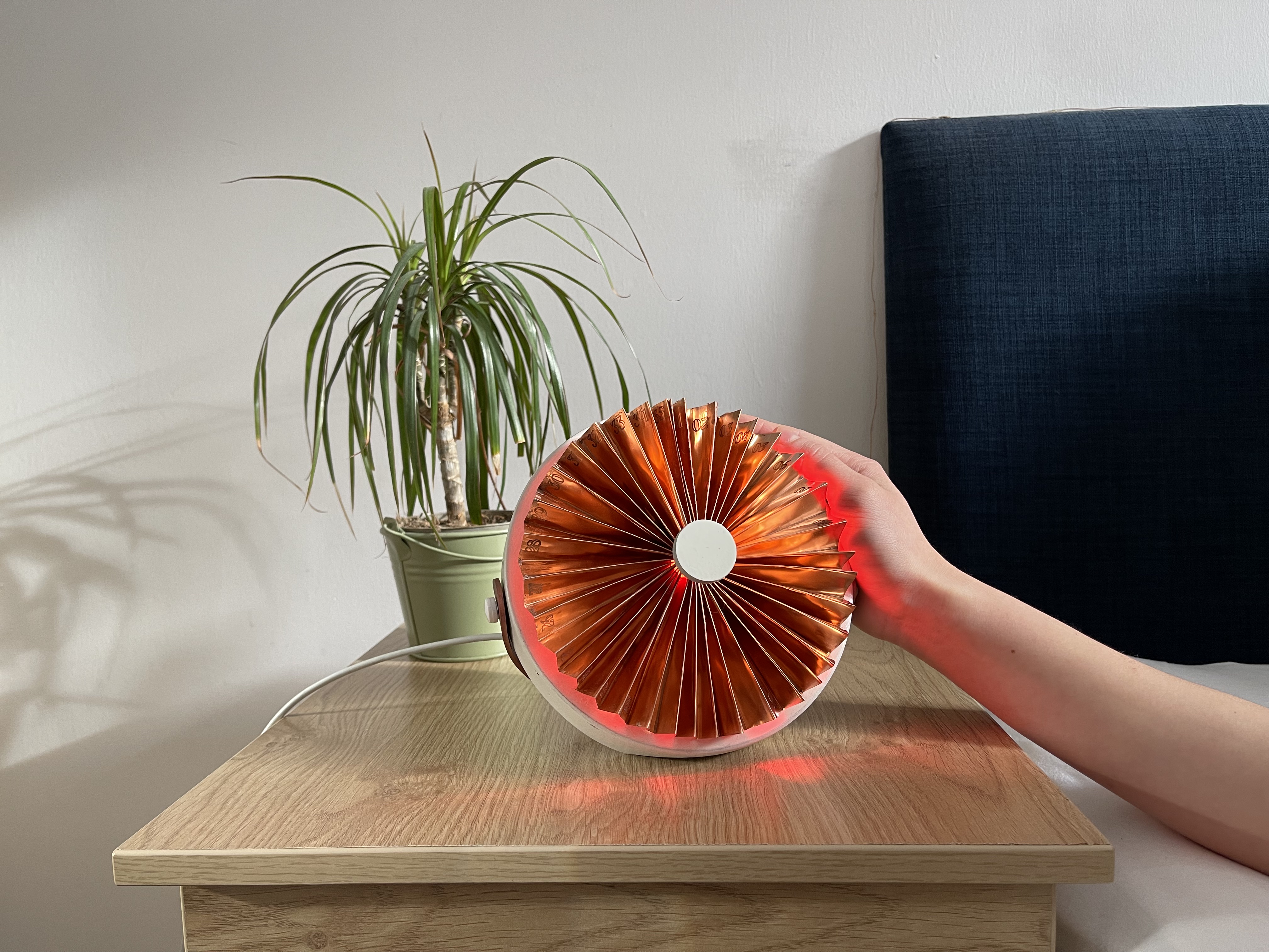
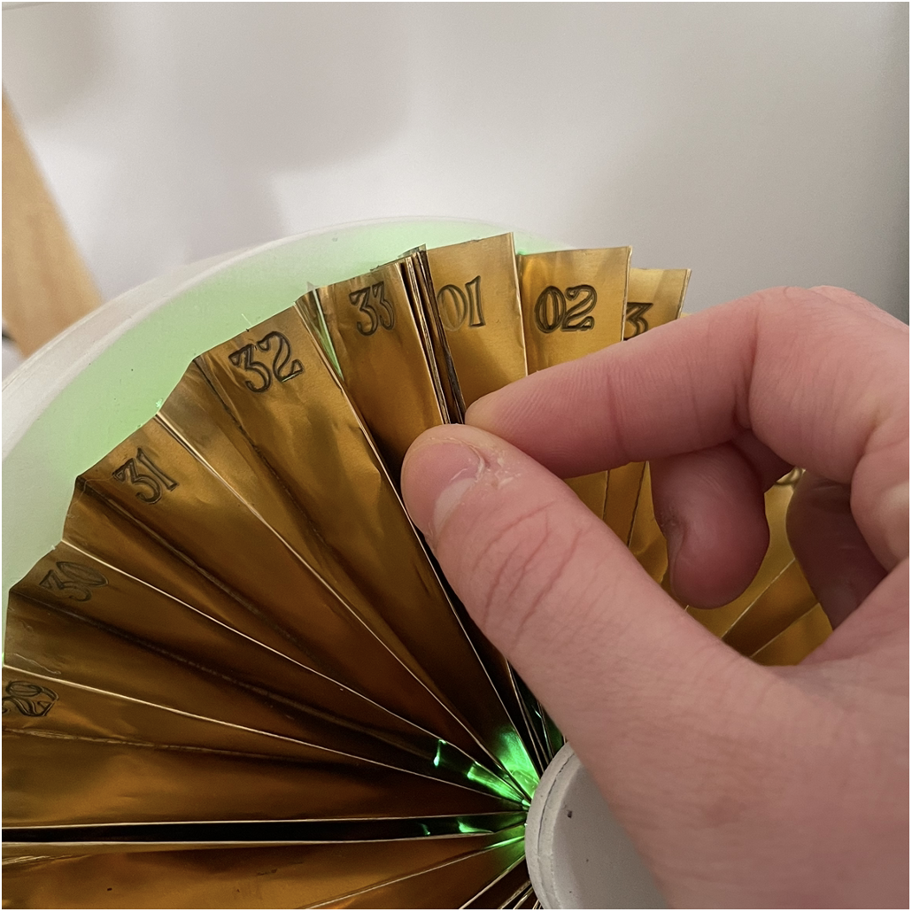
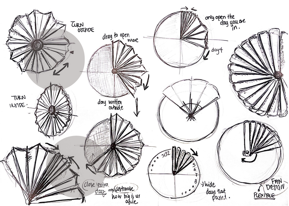
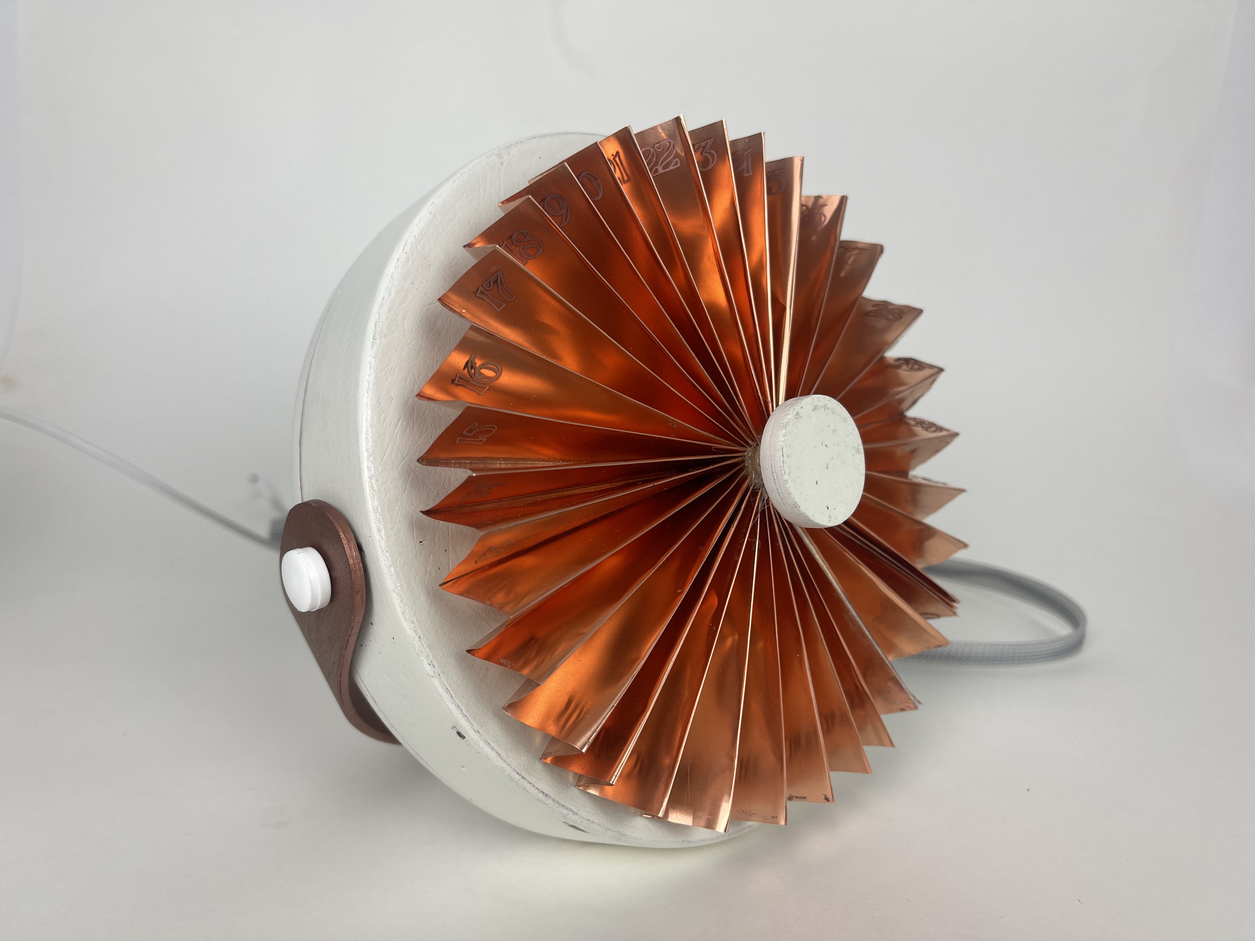
Each fold is one day. Tucks to fit any 21–35 day cycle.
Turns one fold at midnight. Stays current even when forgotten.
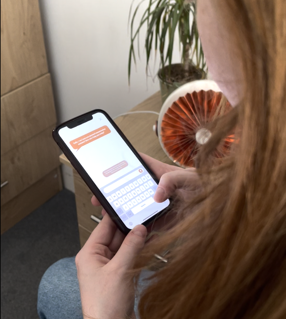
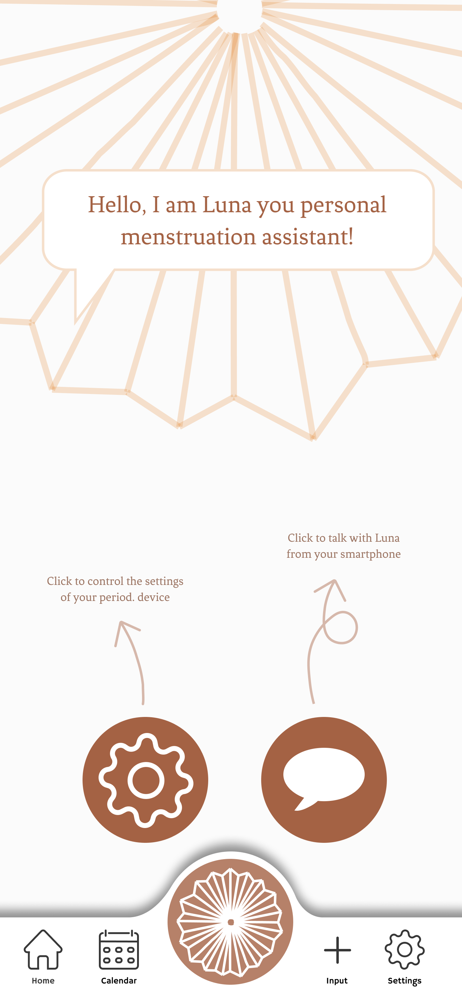
Luna answers cycle questions. Voice at the bedside, text in the app.
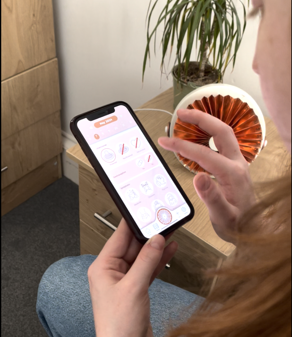
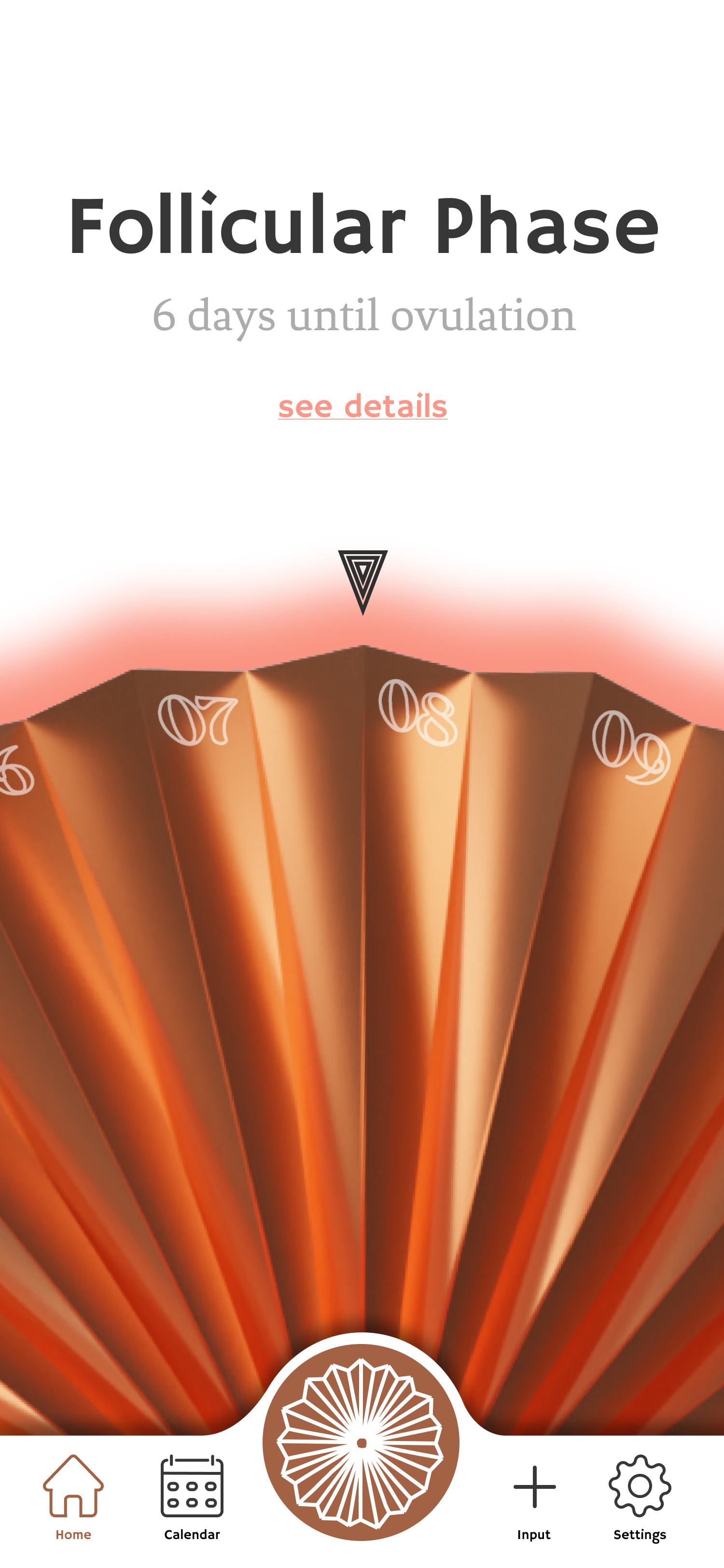
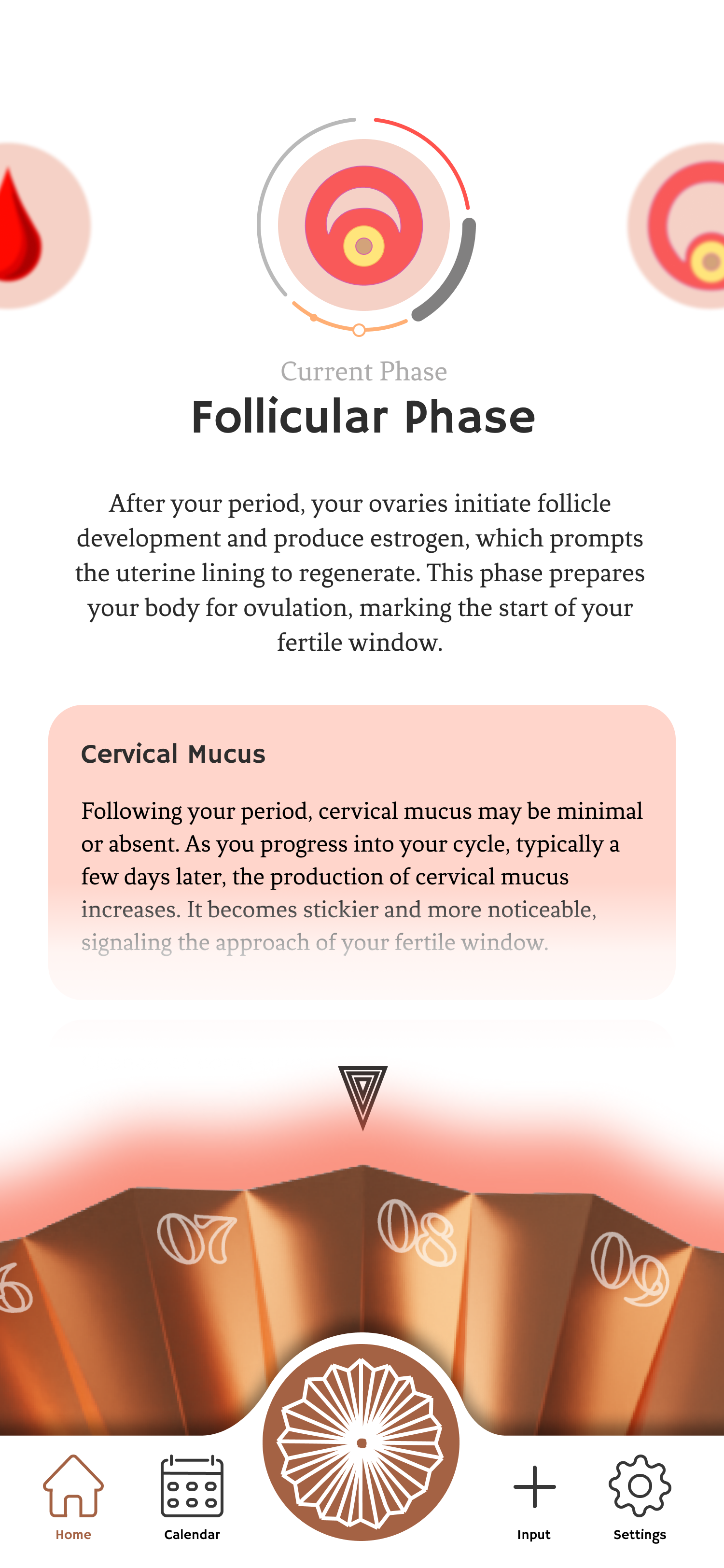
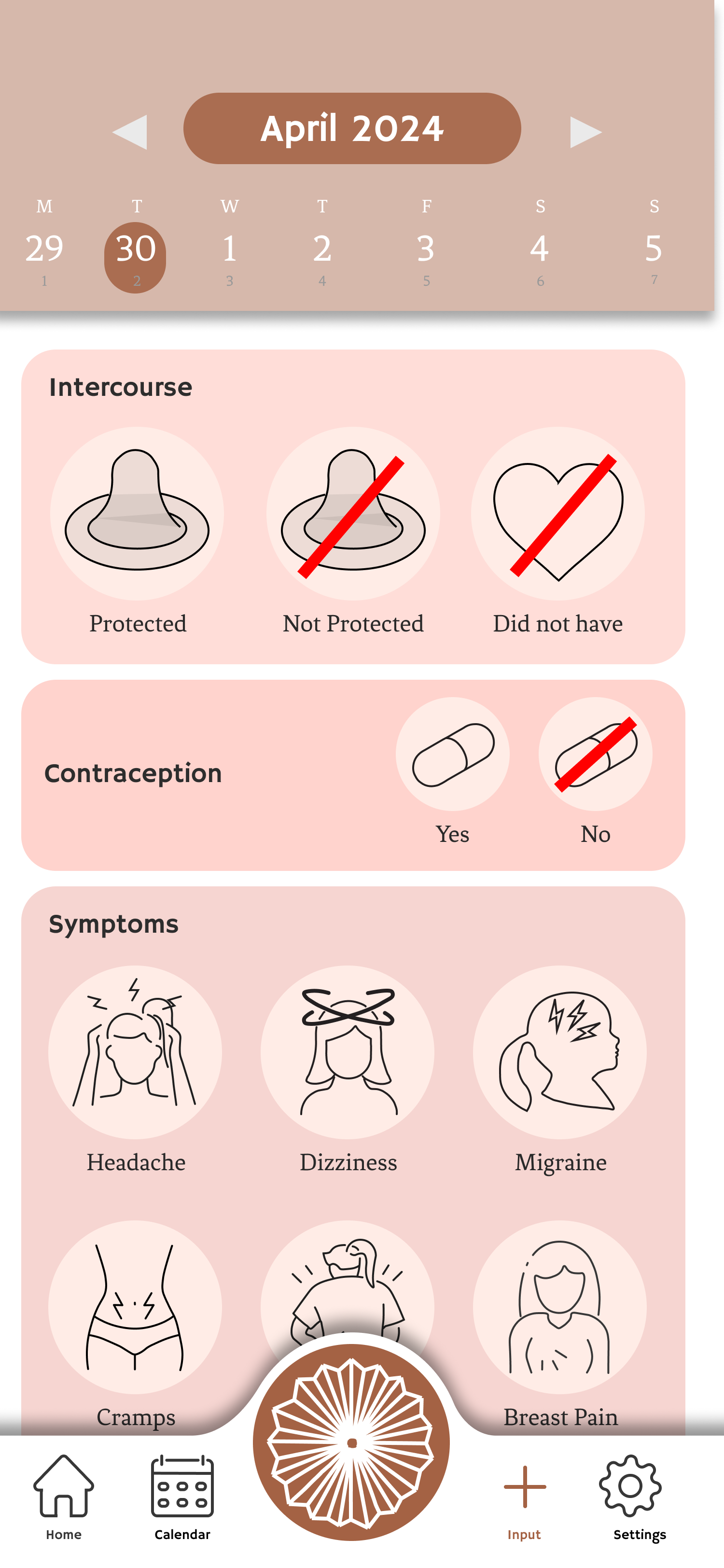
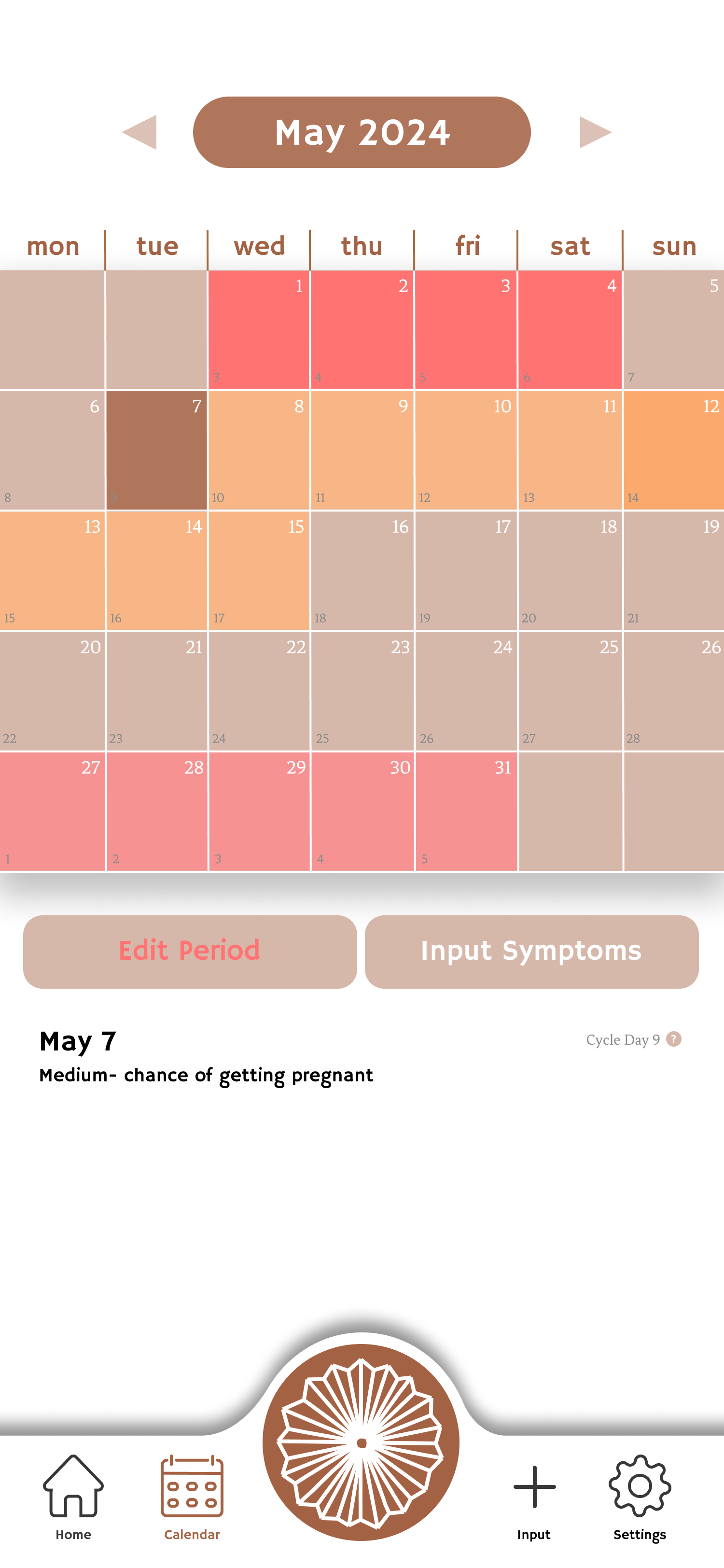
Log symptoms. Read what the phase means for the body.
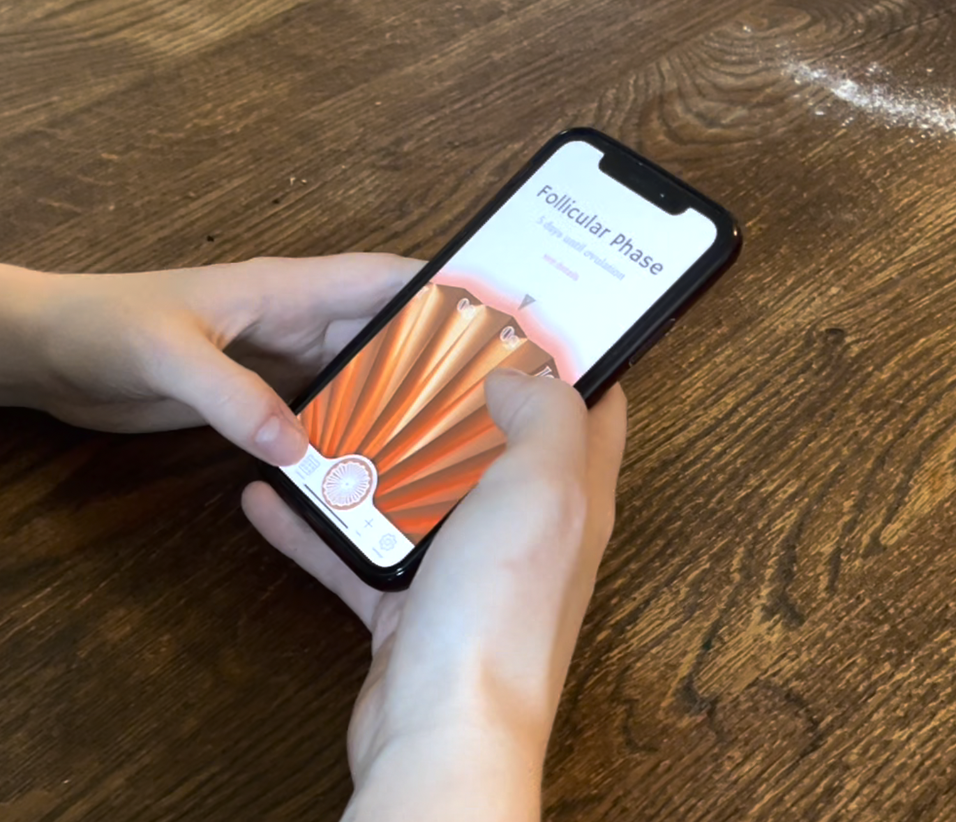
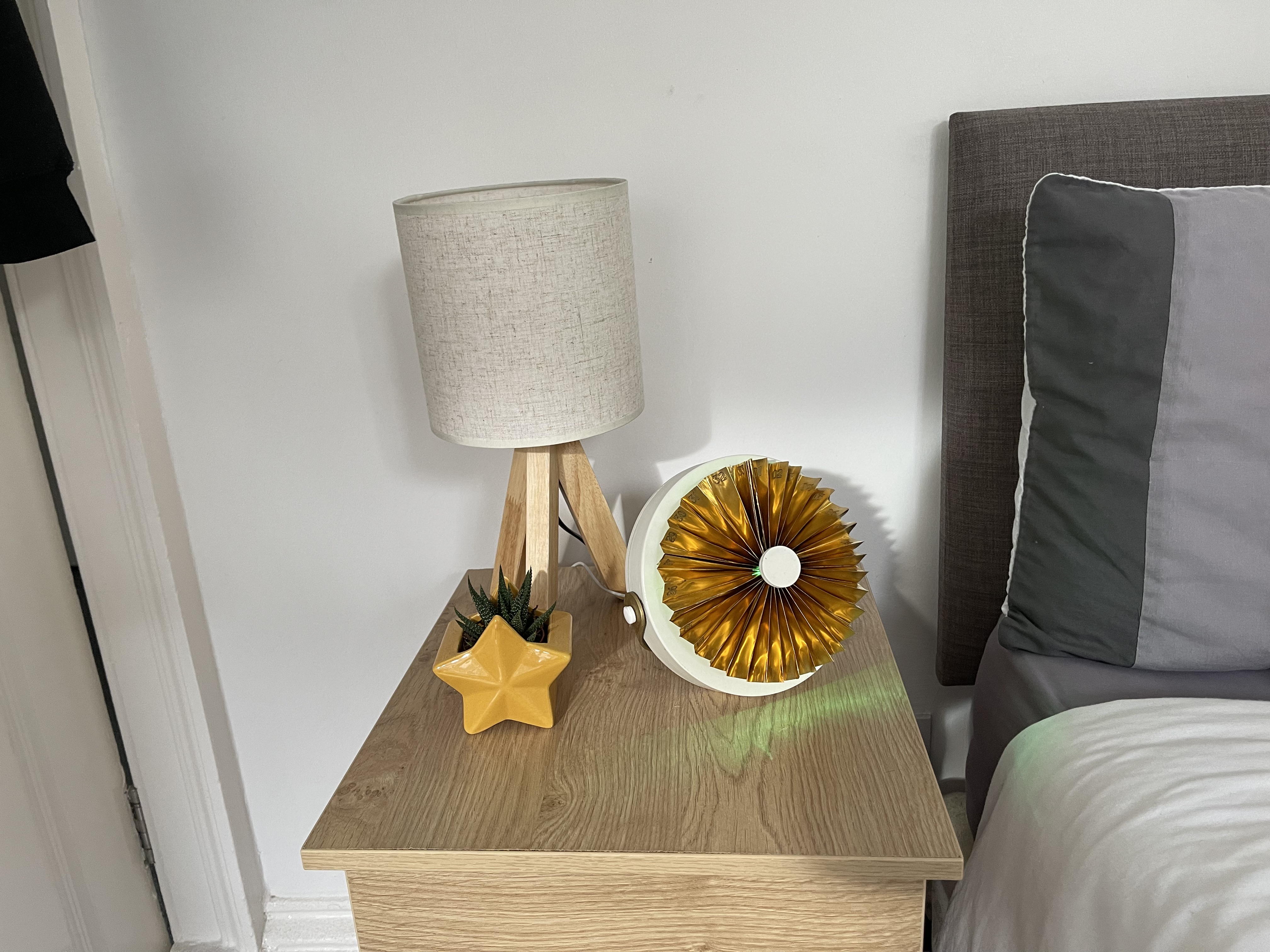
Away from the bedside, the cycle goes with you. Same fan, same theme.
Not two parallel deliverables. The hand-offs are the design.
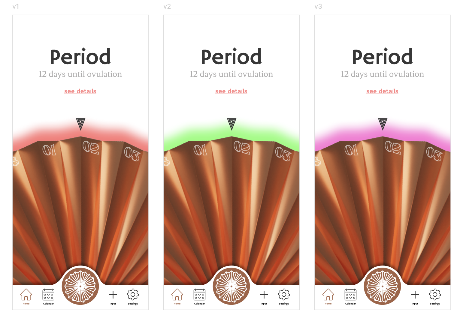
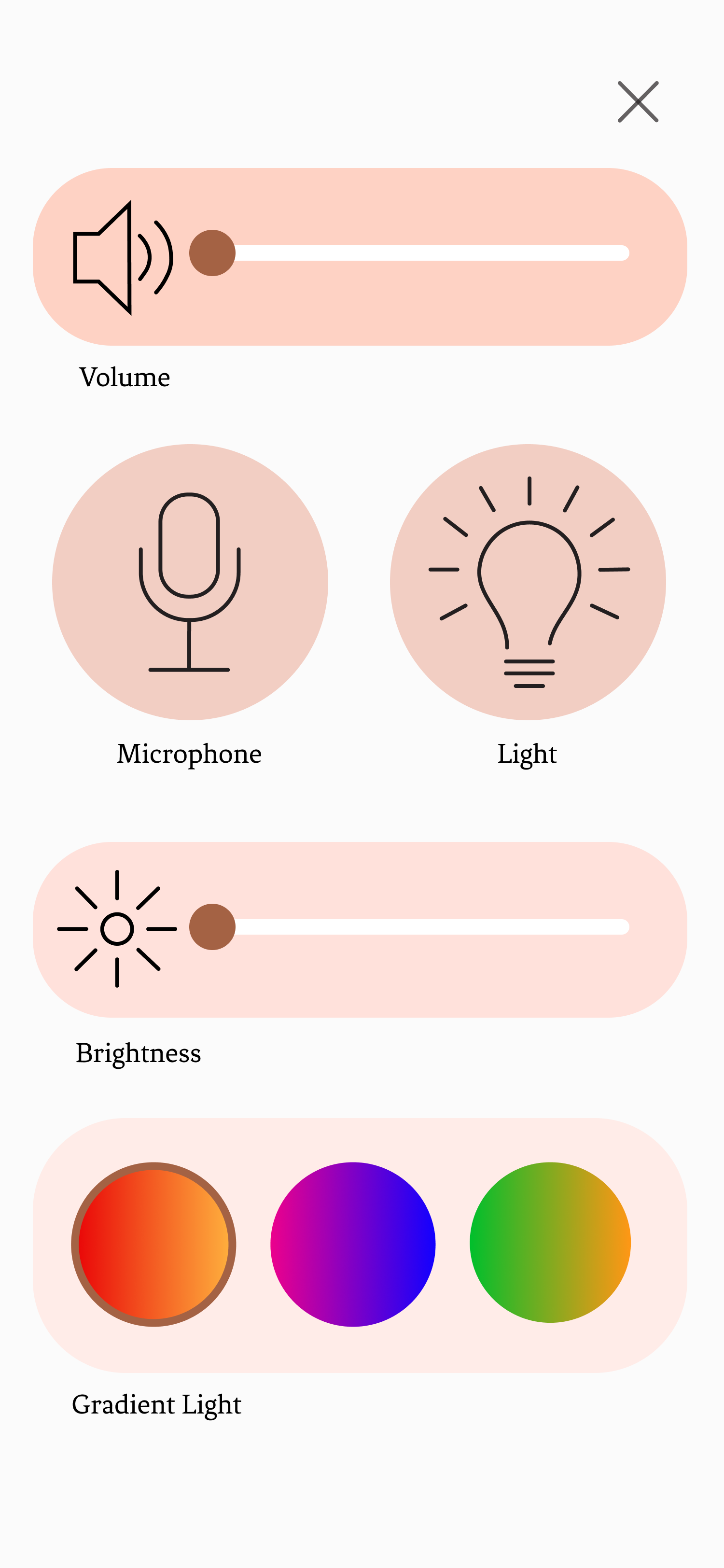
The NeoPixel ring offers three gradients. The app reads that choice and tints every screen to match.
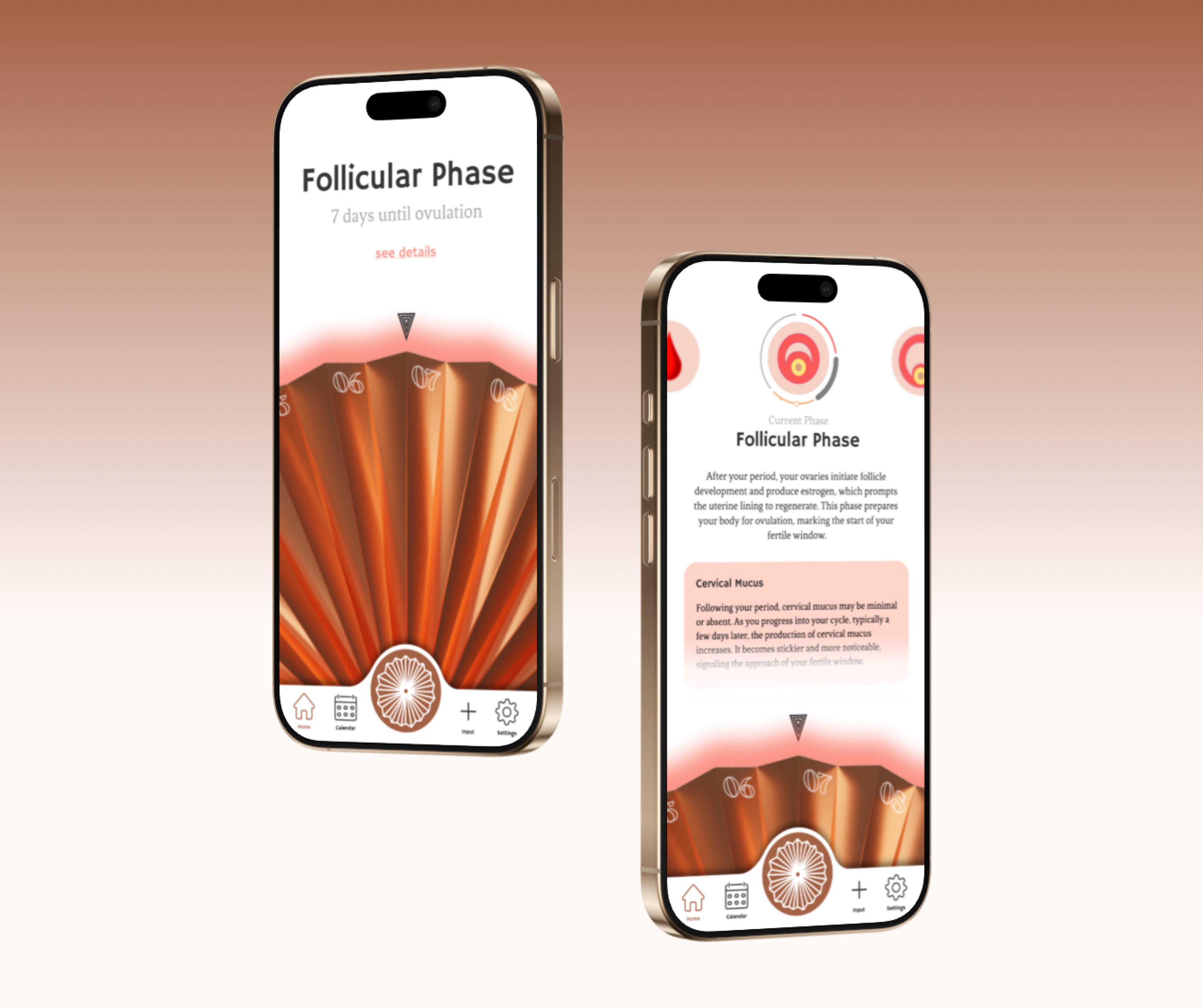
The fan-shape becomes the central button on every app screen, the same anchor as the bedside object.
The same italic display family is engraved into copper and rendered on glass.
The same AI assistant. Speaks at the bedside; types in the app for when speaking out loud is not an option.
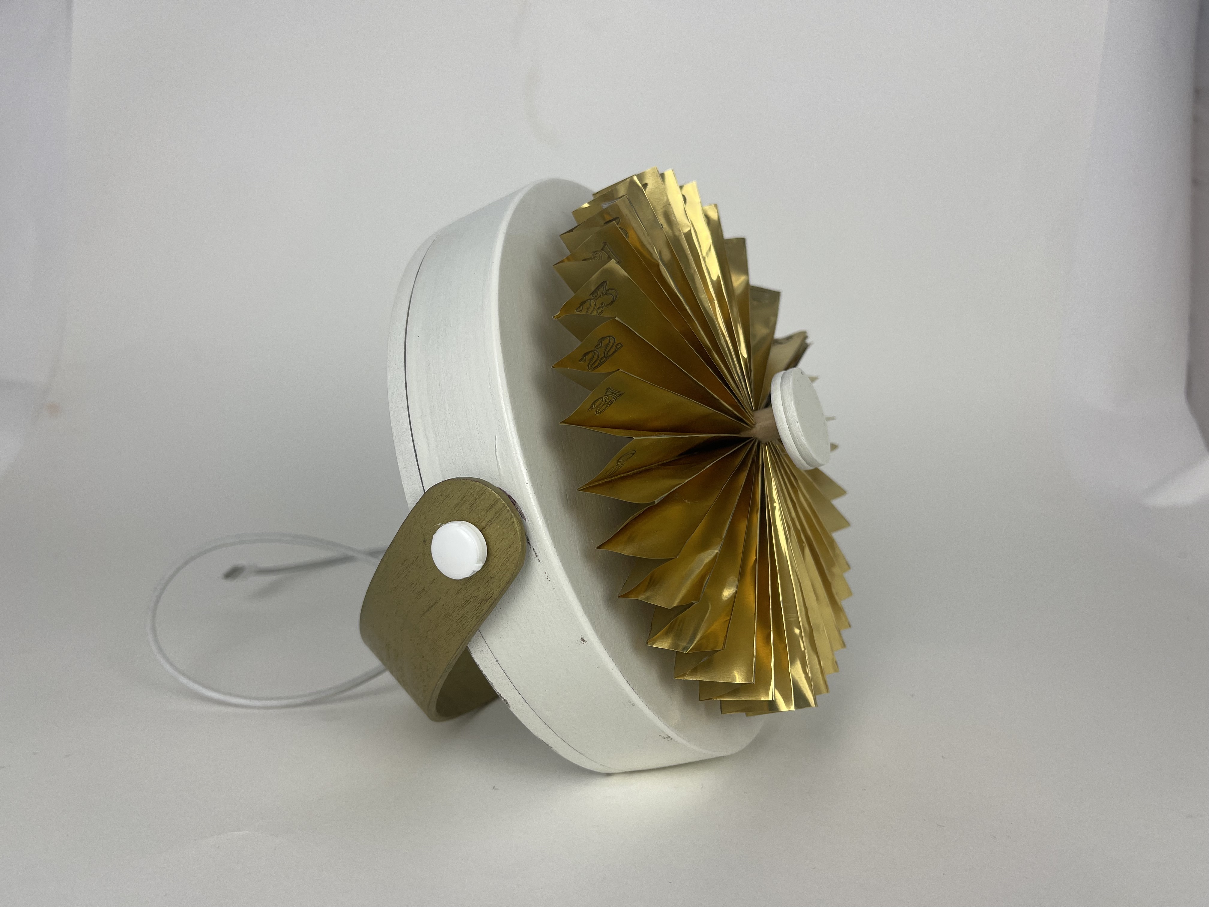
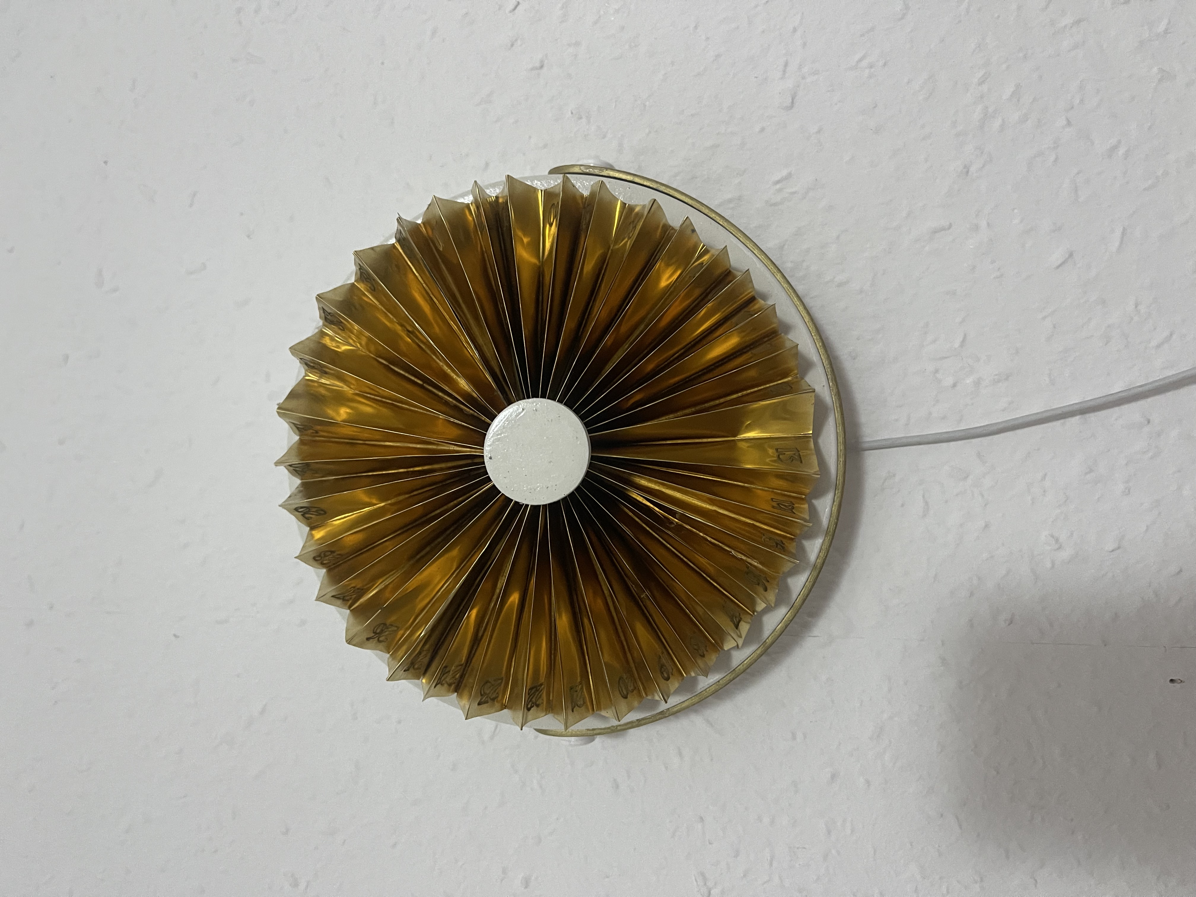
A fan-shaped calendar that visualises the cycle through colour, motion, and light.
Every existing tracker is app-first. The research said that's exactly why women keep forgetting to log.
The fastest, cheapest, most fundable answer. Better notifications, friendlier copy, fewer pink hearts.
The device sits where forgetting is hardest, the bedside. The app exists for what an object can't carry: depth, history, portability.
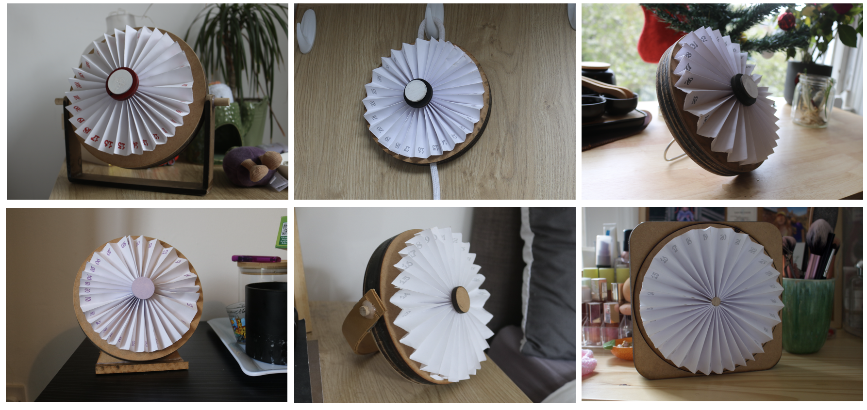
Fourteen concepts. Three prototype stages on the way to copper. One quiet rule running through all of them: it has to look at home on a bedside or on a wall.
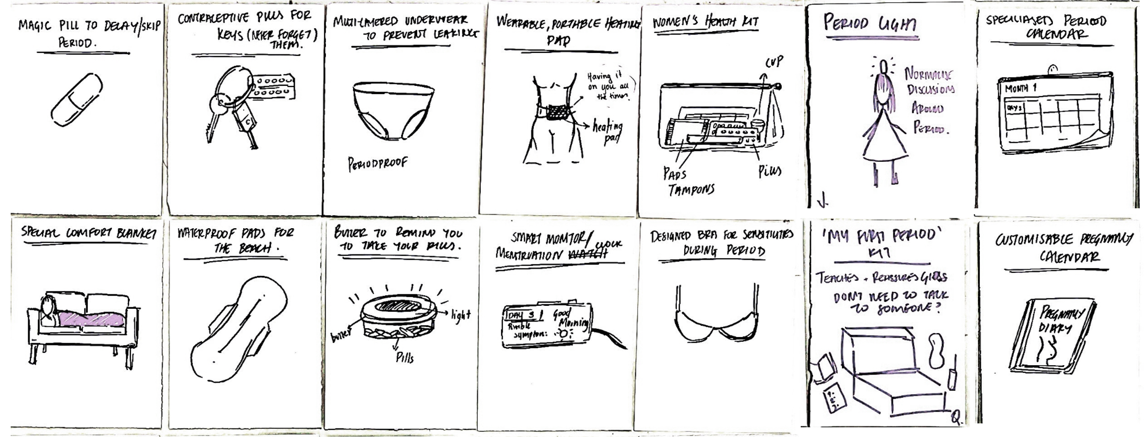
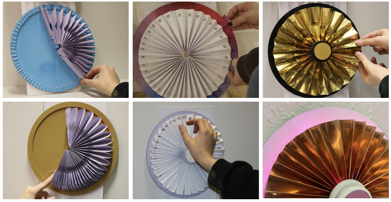
Cycles run 21 to 35 days. Any rigid calendar erases someone.
Date strips, spinning discs, axis cards. Each broke the moment a cycle ran short or long.
An accordion of 35 folds, magnetised. The form adapts to the body, not the other way round.
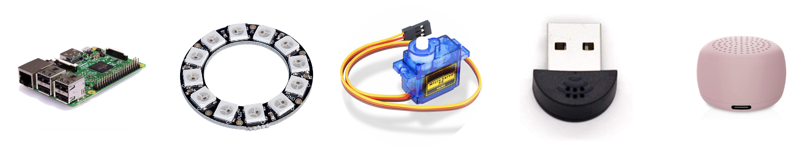
Two parallel tracks: a Raspberry Pi prototype that genuinely works, and a manufacturing plan with a costed bill of materials.
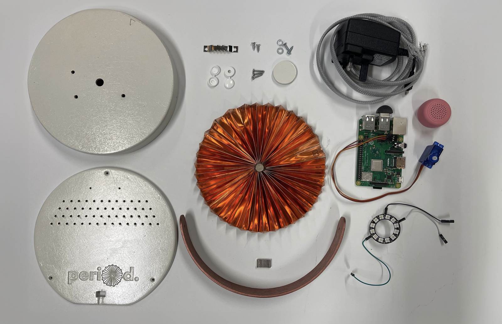
Built in Python. Tracks the cycle day from a stored start date, drives a NeoPixel ring through gradient transitions, turns the metal fan on a servo, takes voice input through a microphone, replies through a speaker via OpenAI's GPT-3.5, scoped to menstrual health and forbidden from diagnoses.
Birch plywood base (CNC-machined). Copper or brass fan (CNC-engraved with day numbers, folded on a press brake). Brass dowel for durability. Custom PCB and ARM Cortex-A35 controller specified for production, modelled on the Amazon Echo Dot teardown.
What a bedside object can't carry: depth, history, and portability.
One sheet of dense iteration. Right margins are self-critique: questions about whether descriptions are too busy, whether the home page needs a calendar, where Luna should live.
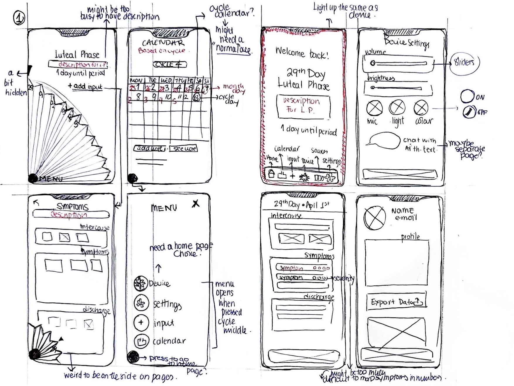
"Might be too busy to have description"
Resolved Phase descriptions move to a dedicated detail page, accessed via a "see details" link."Need a home page choice"
Resolved Home is the cycle status. The menu opens from the central fan button, not a tab."Light up the same as the device"
Resolved App background tints to the user's chosen NeoPixel gradient, syncing with the device.The deciding question wasn't which navigation was cleaner. It was which one was honest about what the product is, a device with a companion app, not an app with an accessory.
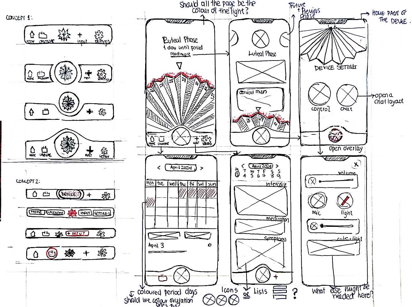
This concept won because the geometry told the story. The fan-shaped central button anchors every screen the way the device anchors the user's day, placing the AI assistant at the literal centre of the app, where it lives in the room.
The NeoPixel ring offers three gradients. The app reads that choice and tints every screen to match. Pink is one option, never the default.
Drawn line by line, not pulled from a stock pack. Forty-plus marks across symptoms, cycle states, input categories, and device controls, all at one consistent stroke weight.
Forty-plus screens across the home, calendar, input, device control, and settings flows. Below, the working prototype walking through a full cycle, then four key states pulled from the deck.
Copper and brass: chosen so the device looks at home in any bedroom palette, and so the user's first decision (before they even open the app) is theirs to make.
"Aesthetic that doesn't compromise functionality, and functionality that respects the user."— Workshop synthesis on what woman-centred design means in practice