A pocketable IoT device and companion app that lets people with chronic GI conditions log symptoms in seconds, without screens, overwhelm, or medicalised interfaces.
Existing apps demand frequent logging and create hyper-awareness that worsens anxiety. The gut–brain axis means stress and GI symptoms feed each other, so a tool that adds cognitive load actively harms the people it's meant to help.
"Existing solutions need too much effort, they cause more stress than relief."— Patient interview · 2024
Two sessions, project start and mid-development. Key finding: patients can't accurately describe symptoms to doctors without a tracking tool.
Guided conversations and a day-mapping exercise. Identified the anxiety–symptom cycle and the emotional cost of existing tools.
5 users, 5 days. Participants used three leading GI apps and kept diaries. All created hyper-awareness and data overwhelm rather than genuine understanding.
"People need a fast, low-stress way to capture lived experience, and return only the most helpful insights."— Design insight · synthesised from research
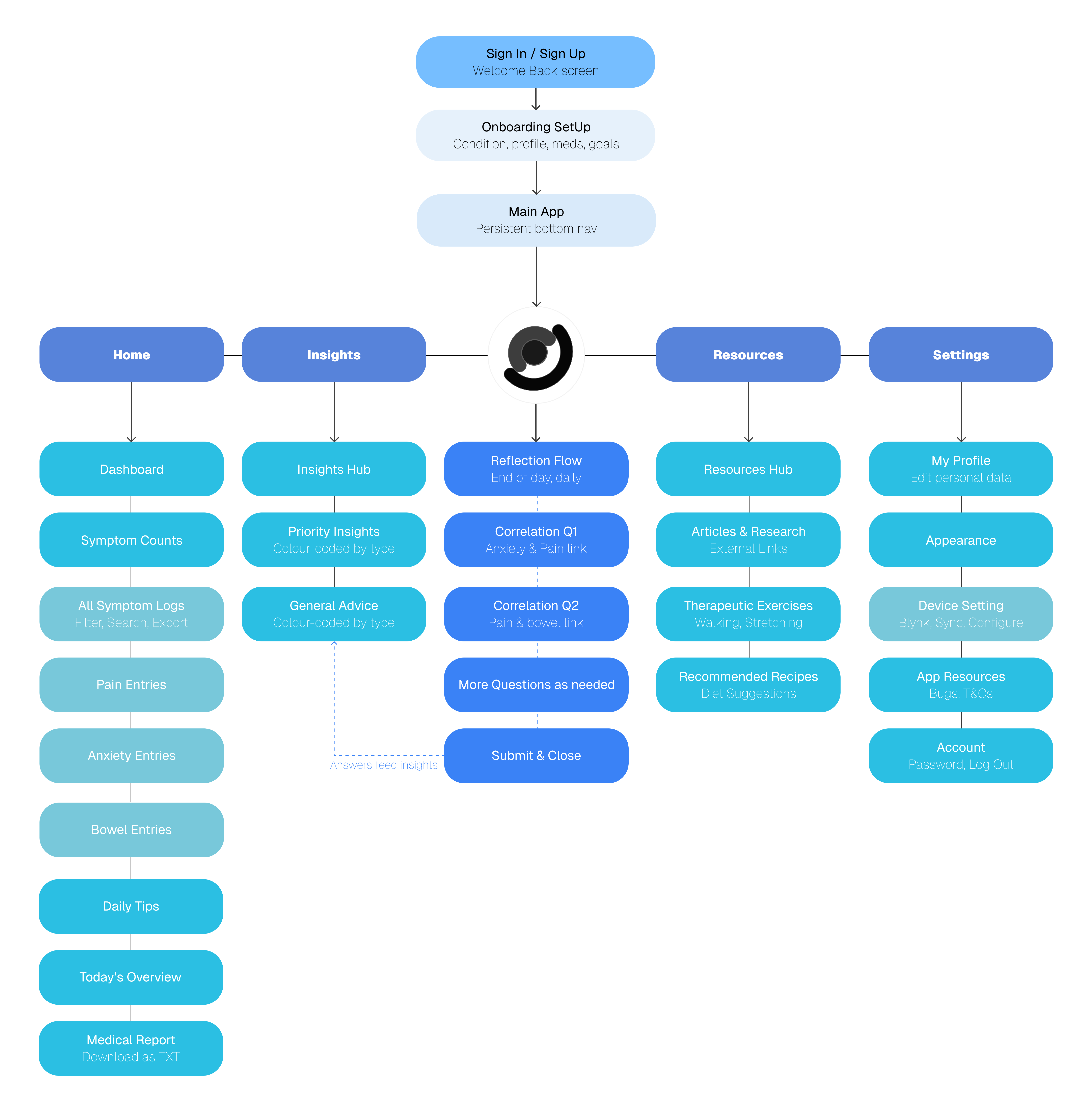
Four moments. Two on the device, two in the app. The hand-off between them is the design.

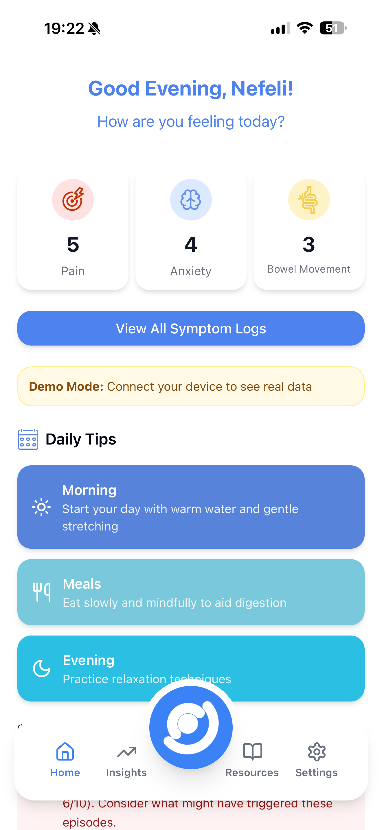
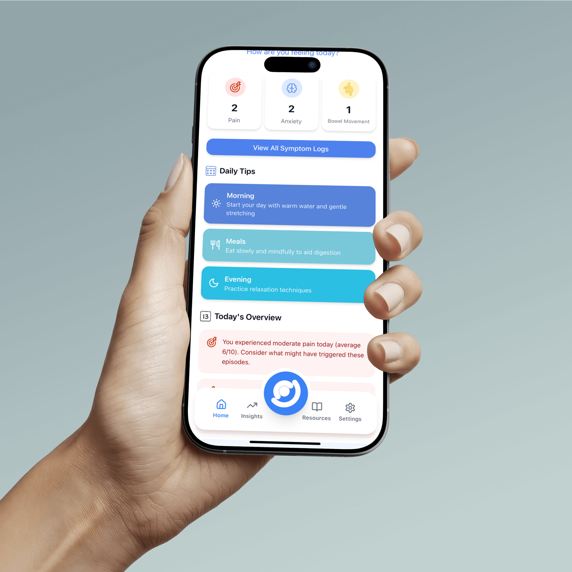
Pain, anxiety, or bowel movements in seconds, without opening anything.

Press anxiety and the device responds, a 5s inhale / 5s exhale pulse, before logging.

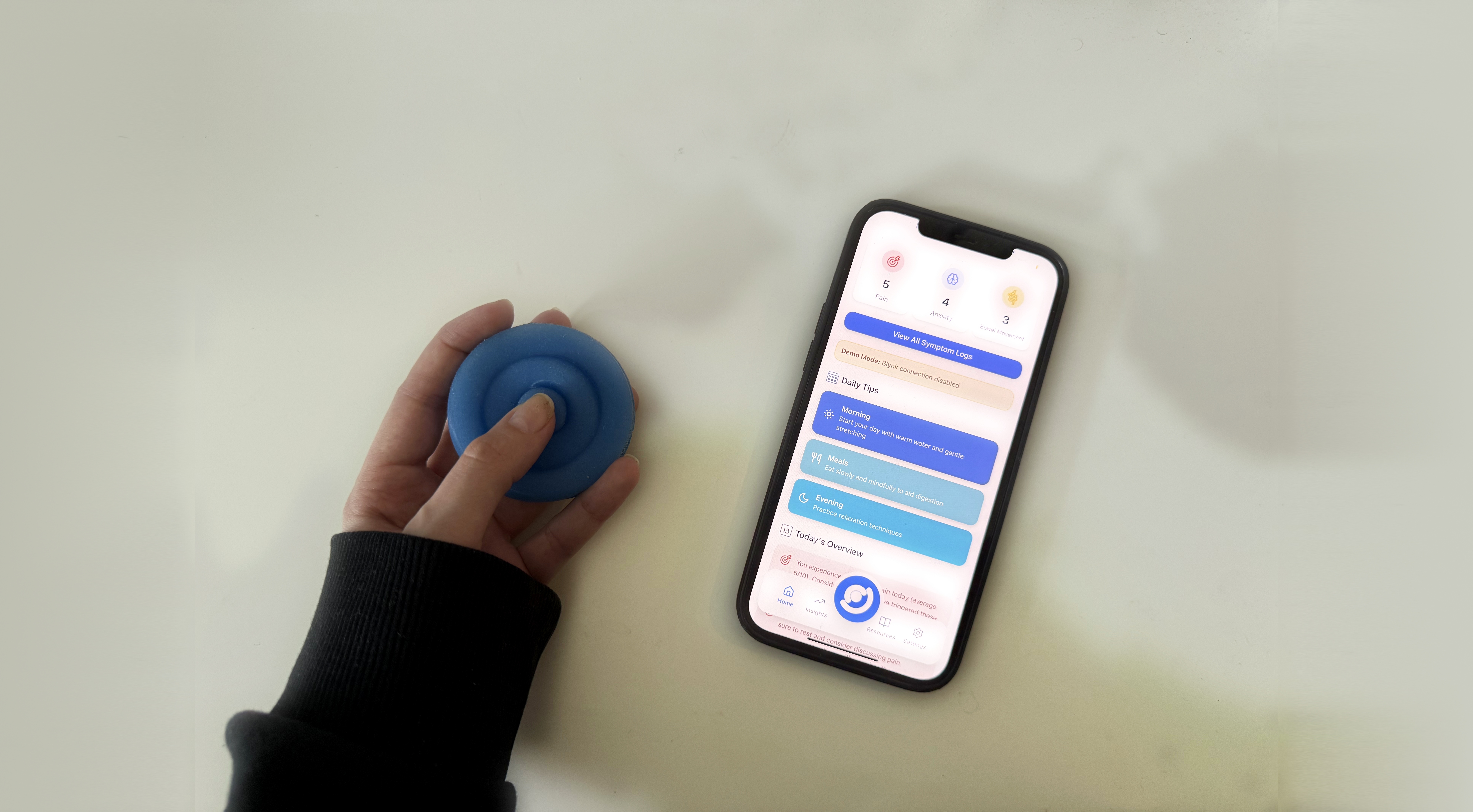
A single end-of-day question, generated from what was logged. No daily input required.

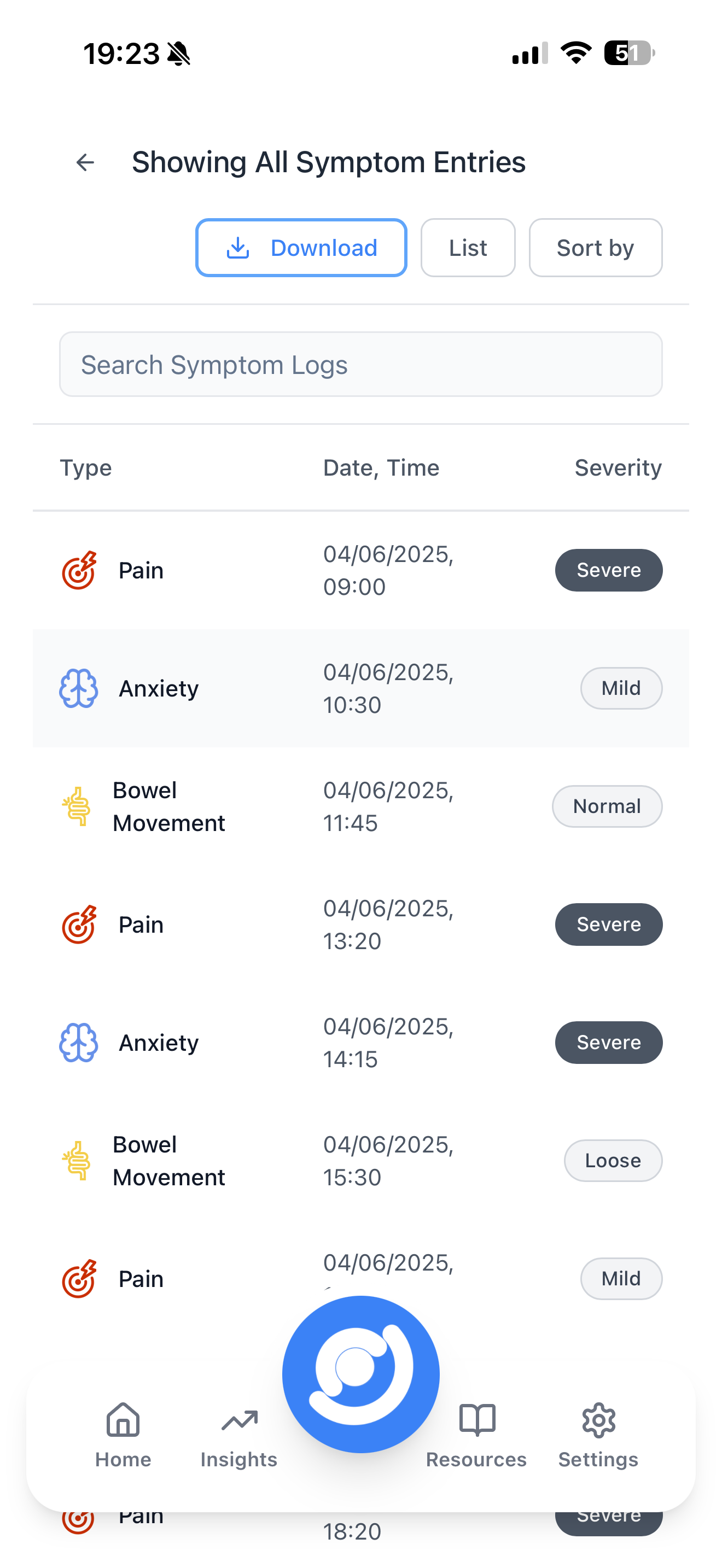
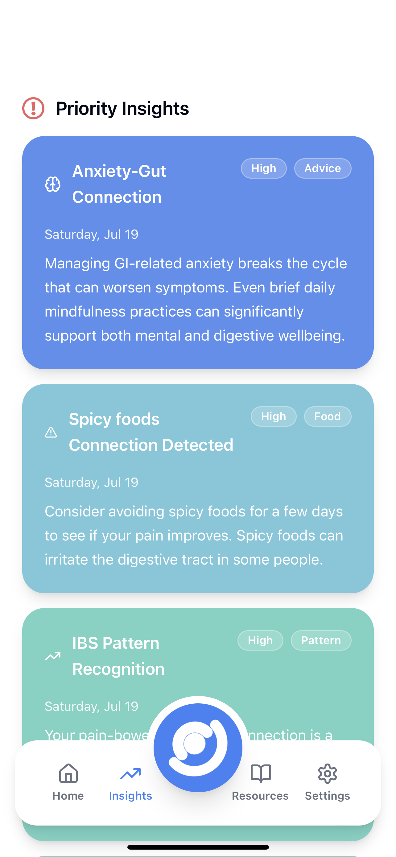
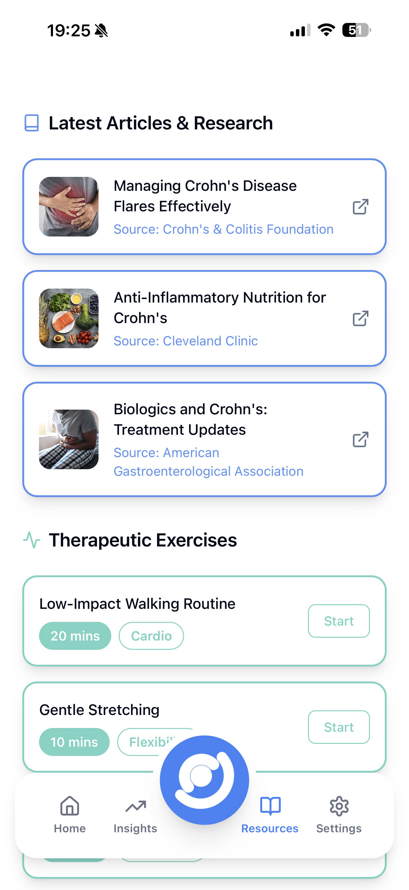
Patterns surfaced as plain-English insights, prioritised. No charts, no jargon.
Not two parallel deliverables. The hand-offs are the design.
The anxiety button triggers a calming pulse on the device, then surfaces as a reflection prompt in the app at end of day.
The device's three buttons aren't arbitrary. Each one defines a bank of reflection questions the app can ask.
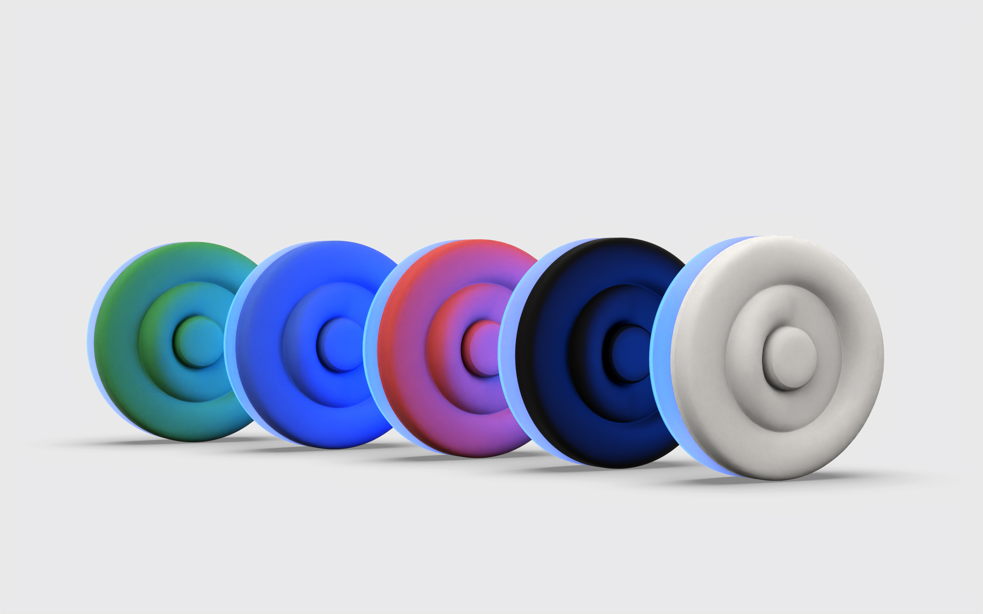
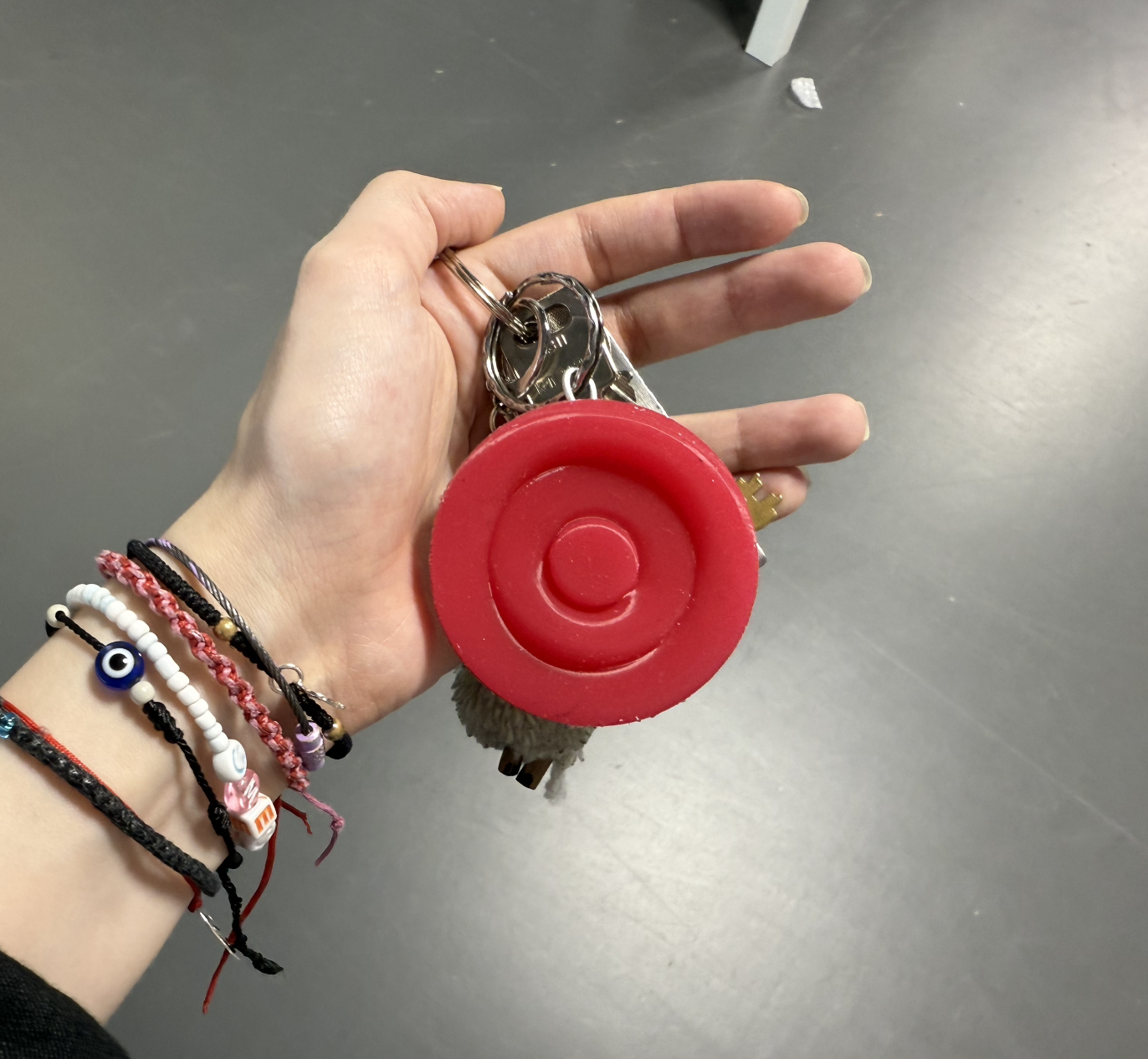
The device's concentric rings became the logo. The logo's o became the brand name, onaka, "tummy" in Japanese.
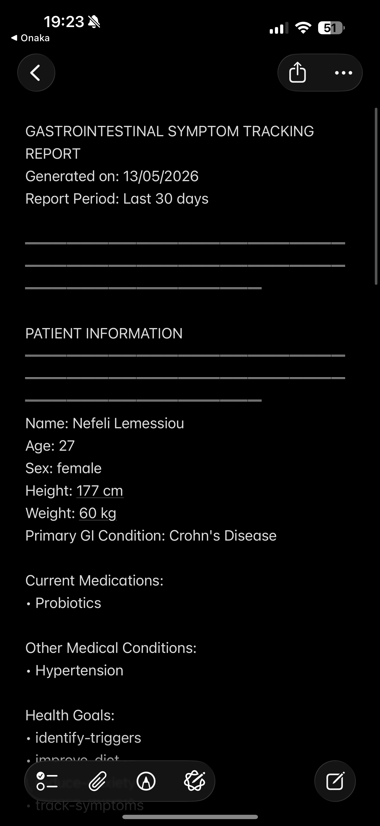
The device captures symptoms a patient can't recall in clinic. The app compiles them into a shareable medical report.
A pocketable, tactile object designed for seconds-long capture, without screens or screens-shaped behaviour.
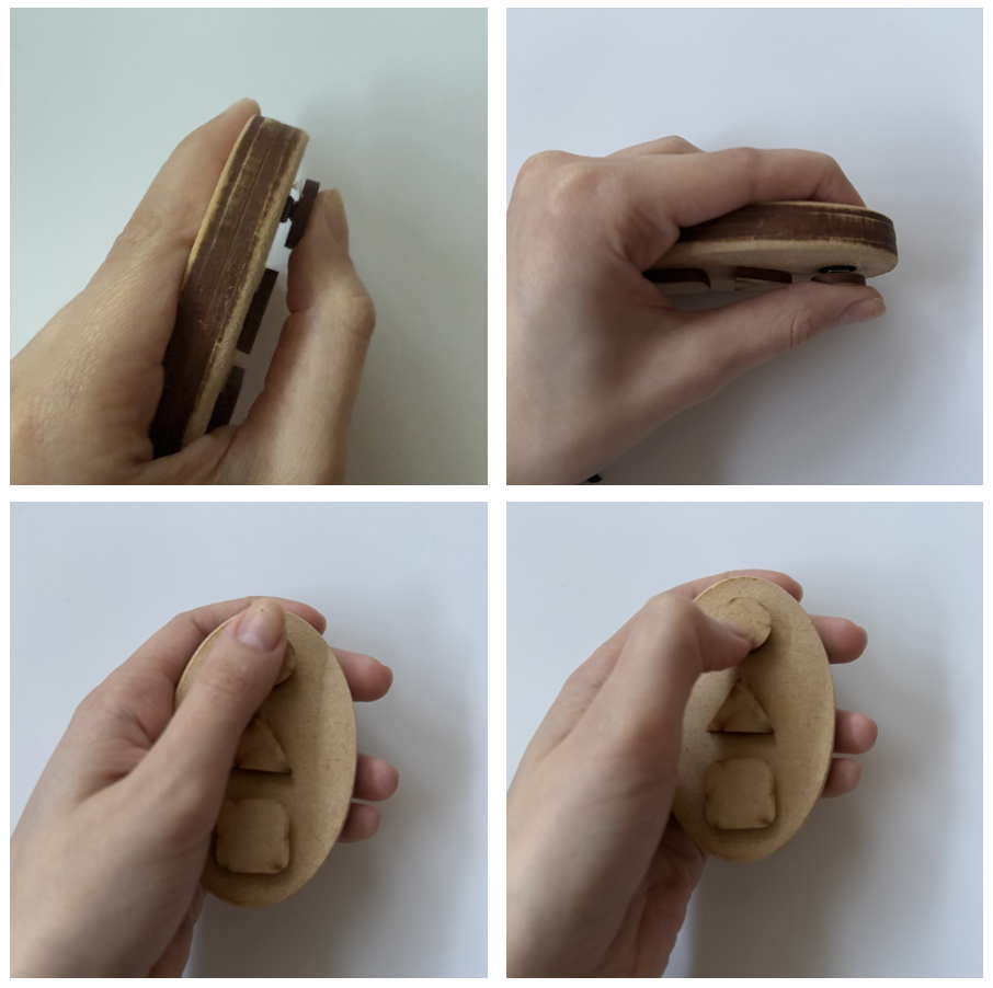
Users loved the tactile quality of squeezing fabric, but they couldn't trust their inputs were registering. The data corrupted itself.
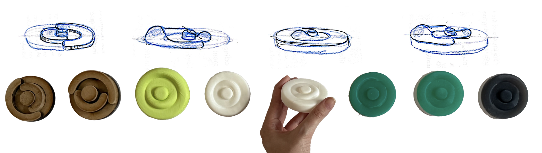
Three gestures to log three symptoms. Tactile and playful, but unreadable to the device.
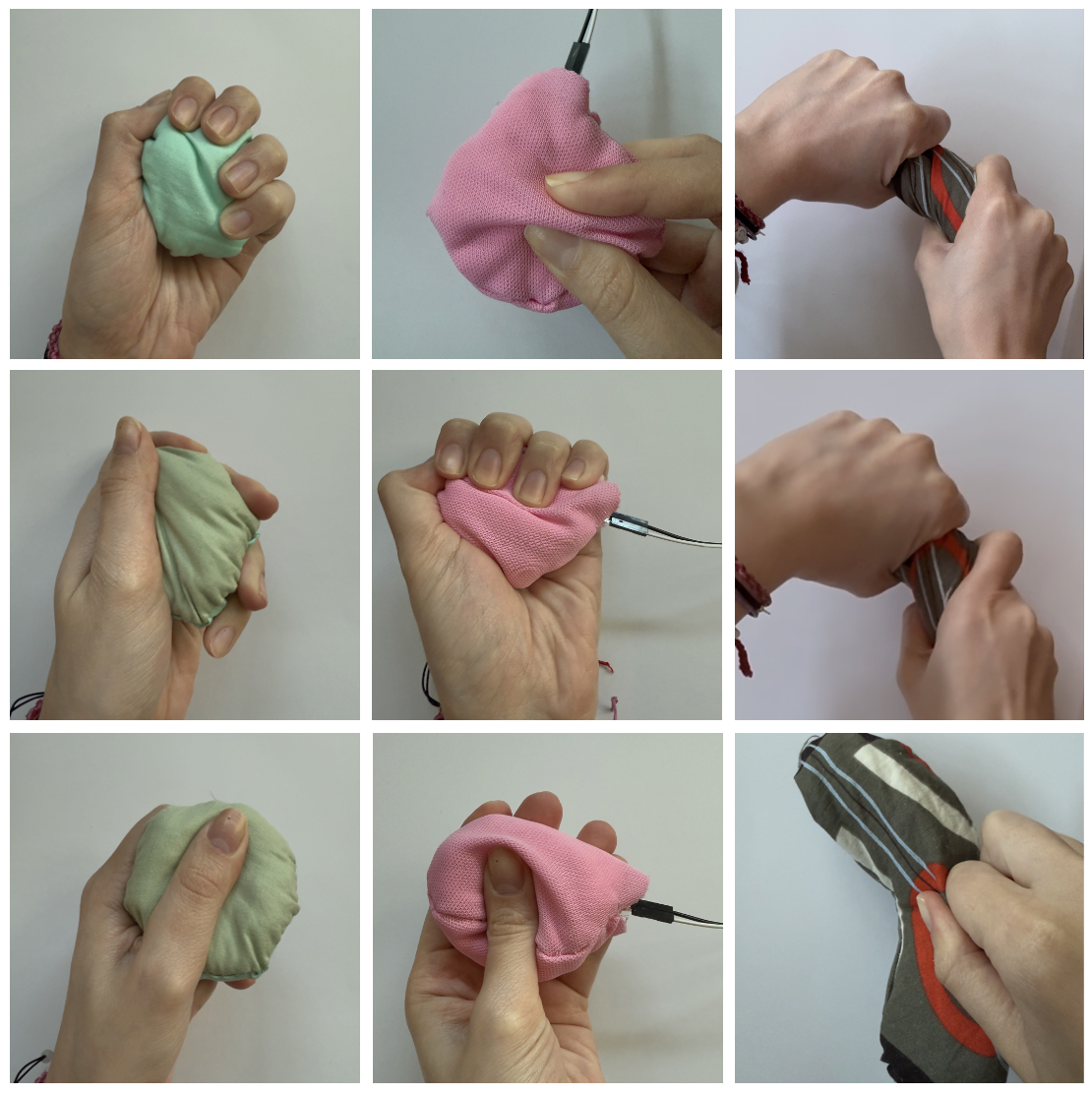 this didn't work
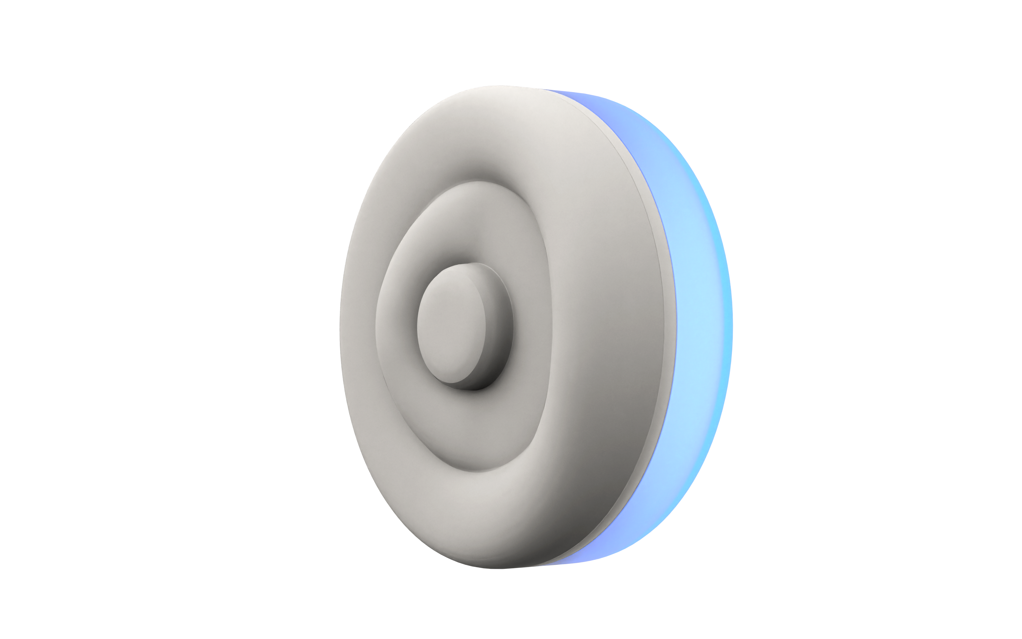
Buttons give immediate, unambiguous confirmation. Concentric ring layout means each is distinguishable by touch, usable from a pocket without looking.
A second gastroenterologist interview asked which daily GI factors matter most to capture. Pain, anxiety, and bowel movements were chosen because they are spontaneous, identifiable in the moment, and the visible surface of deeper patterns. This lets the app generate targeted reflective questions rather than asking users to fill in a form.
"Capture the minimum data that allows meaningful questions to be asked at end of day."
The most urgent symptom. Short press = mild, long press = severe.
Triggers a blue NeoPixel breathing pulse, 5s inhale / 5s exhale, as immediate calming feedback.
Three press durations differentiate between normal, loose, and hard movements.
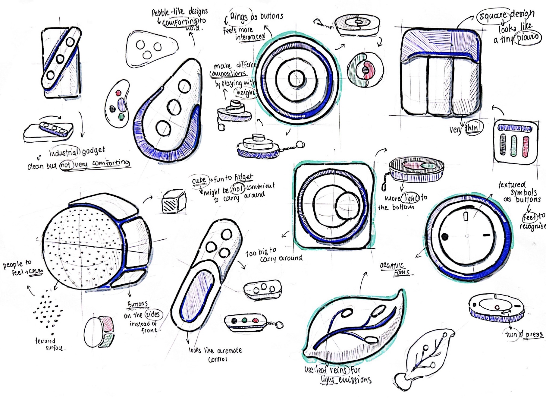
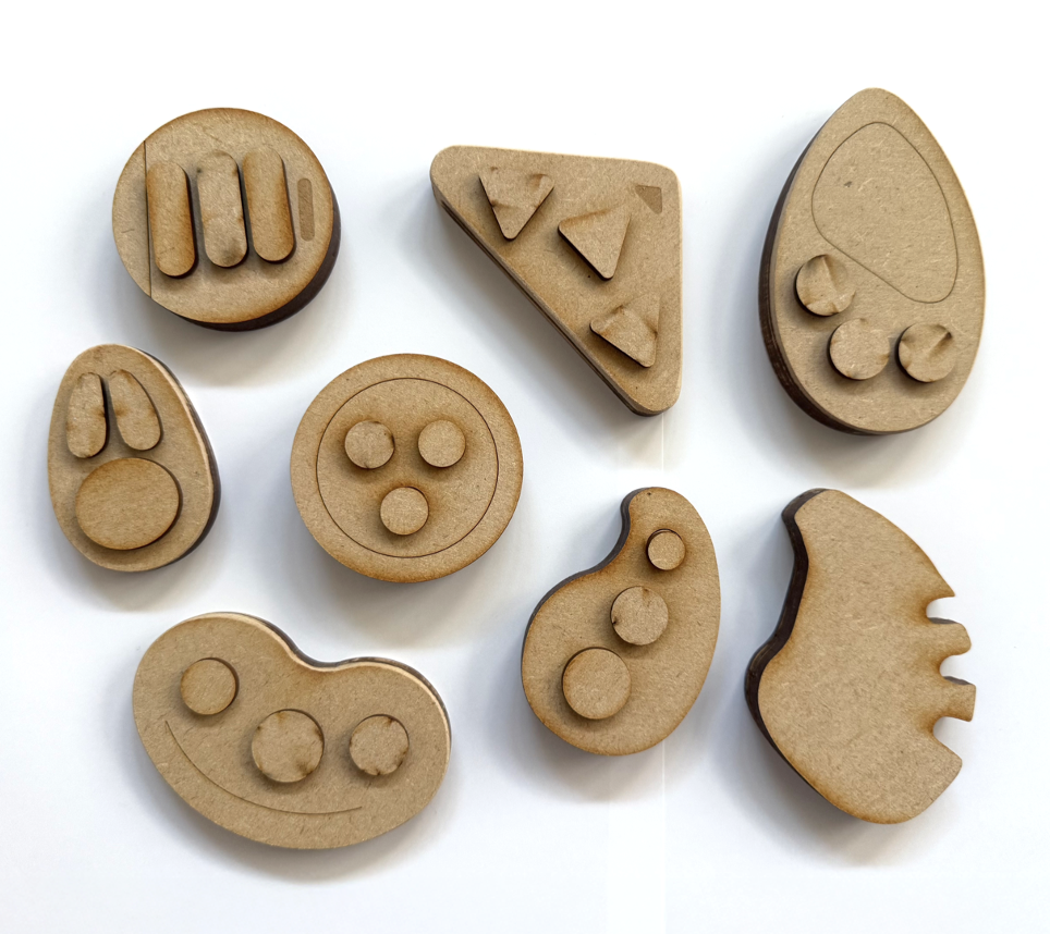
The brief was a calm object that lives in a pocket, presses without looking, and feels nothing like a screen. Many directions, many MDF prototypes, then silicone, on the way to the final form.
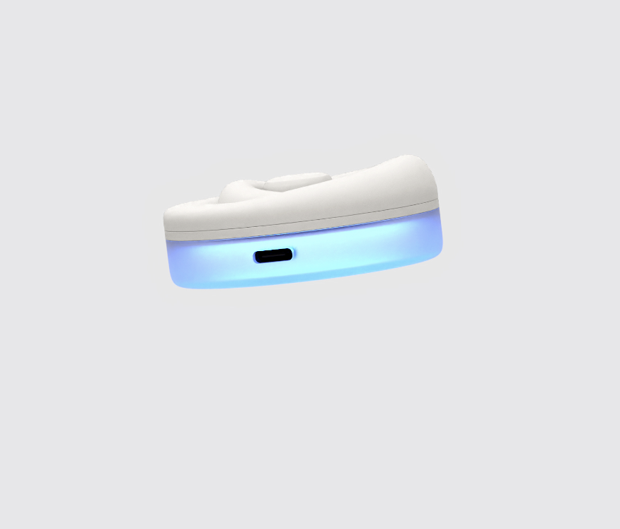
The internals went through three microcontrollers before settling on the SparkFun Qwiic Pocket, the only board small enough to fit the final 60 mm form factor while still carrying Wi-Fi. The full electronics stack runs on a 1200 mAh LiPo, charges over USB-C, and pushes button events to the app over Blynk IoT.
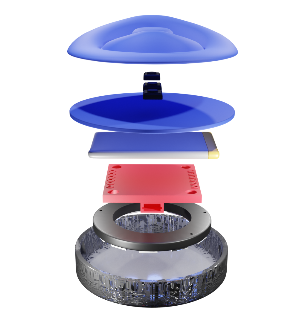
Two-part cast silicone with three integrated buttons. Skin-safe, water and UV resistant, dyed in matte finishes. Sits over a 2 mm PLA stiffener so presses register without flex.
Connected via 2-pin JST. Charges through a USB-C port machined into the SLA base. Sized for several days of typical use between charges.
Wi-Fi-capable microcontroller chosen for its compact footprint, the third board after testing M5StickC Plus and Arduino Nano 33 IoT. Pushes events to Blynk over Wi-Fi.
Mounted under the rear face. Pulses blue at 5 s inhale / 5 s exhale for anxiety, confirms button input, and shows connection and battery state.
Each button press is sent as an event to the Blynk cloud, which the app retrieves via auth token. A demo mode bypasses the cloud for offline review.
The prototype uses PLA for the stiffener and SLA resin for the translucent base. Both are slated for swap to injection-moulded polypropylene in production for durability and cost. The current SparkFun board is a development part, the production direction is a custom PCB sized to the same 60 mm footprint.
What a pocket object can't carry: reflection, history, and a trail for the doctor.
Four parallel low-fidelity prototypes were built in Figma, each testing a different input philosophy, and put in front of 5 participants over several days. The winning method defined the entire app's interaction model.


Every input the app would ever ask for got rebuilt as a multiple-choice prompt. No blank fields, no "type your answer here", no voice capture. Voice survived in one place only, as the AI's voice when reading the daily reflection question aloud, never as the user's.
"The device handles all logging. The app exists for reflection, and reflection happens at the user's most tired moment of the day."
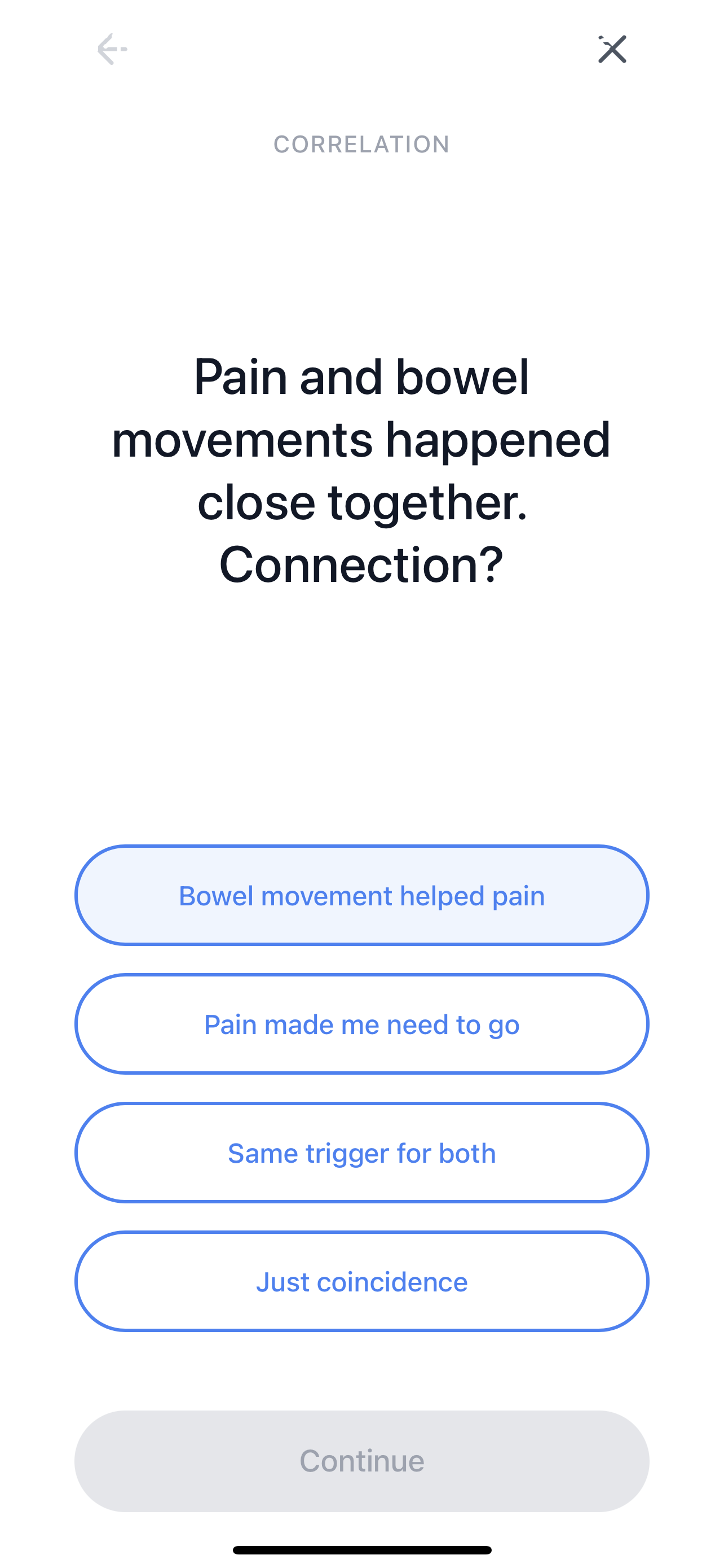
Three banks behind the scenes, one for bowel, one for pain, one for anxiety, plus an end-of-day wrap-up. When two symptoms occur close together, the app pairs them and asks a conditional question that links the two.
"Did the pain lessen after going to the toilet?"
"Did the anxiety arrive before the pain, or after?"
"Did stress feel like it changed what happened in the gut?"
Answers are written back as short, plain-English insights, prioritised by urgency.
Pain has eased after bowel movements three times this fortnight.
Anxiety tends to precede pain by 30 to 60 minutes on weekdays.
Bowel discomfort followed dairy four times this month.
Try the device's breathing pulse next time anxiety arrives.
Four bottom-nav tabs cover everything passive, Home, Insights, Resources, Settings. The reflection flow sits on a fifth, central button, raised above the bar, marked with the logo. It's the only place the user is asked to think, and it lives where the app's geometry naturally points.
The base palette is shades of blue, chosen against the clinical grey of existing GI apps and the pink of period-tracker conventions. Symptoms keep three warm accents so they read at a glance in logs and insights.
The mark started as the device's three concentric rings, simplified into a circular form that doubled as the letter o. The product needed a name with an o in it that the logo could replace. Onaka, Japanese for "tummy," fit the meaning of the product and the shape of the mark in a single word.
A walking prototype, end to end, hardware to insights. Below, the app demo running on the device, then the six screens that anchor the day-to-day experience.