Project 03 · NUMA
Year October 2025
Context Product design concept · self-directed
Role Sole designer · research, UX, UI, branding

A health app that tells you what to do, not just what you did.

NUMA turns a day of scattered metrics into a single clear answer to what should I do next to feel better.

UX Research UI Design Information Architecture Wireframing Branding
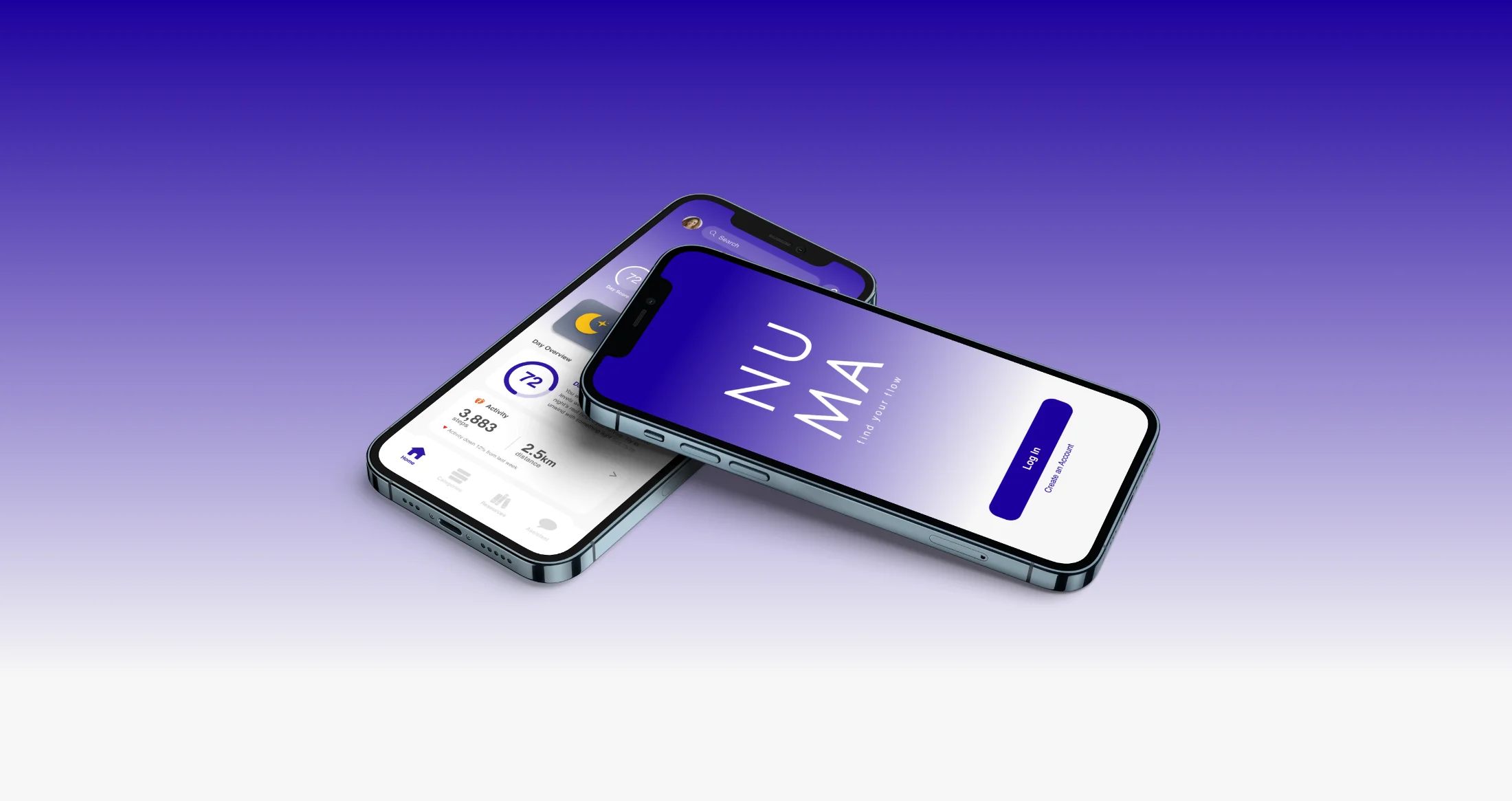
The numa app shown on two iPhones against a purple gradient: the NUMA splash screen and the Home screen with the day's metrics and Day Score
§ 01 Brief + user not another app full of charts

Design a premium health app that feels luxurious yet simple.

The brief: a health app that tracks metrics, follows personalised plans, and surfaces insights through an elegant interface, combining analytics, AI, and wearable integration. The hard part: advanced analytics usually means more charts. A balanced lifestyle means fewer. The project lives in resolving that tension.

"I don't need another app full of charts. I just want something that tells me what I should do next to feel better."
George Matthews · primary persona
George Matthews, the primary persona: a man in his mid-fifties in a light blue shirt
George Matthews
54 Venture capitalist Married Runs regularly

A busy professional balancing a high-stress job with family life. He runs and eats well, but has no time to analyse complex data.

What frustrates him
  • Health apps that feel overwhelming and data-heavy.
  • Graphs and metrics he has to decode himself.
  • Anything that needs manual tracking he has no time for.
What he wants
  • Quick, clear suggestions: rest, move, hydrate.
  • A dashboard around the metrics he actually cares about.
  • To feel in control, without anxiety over the numbers.
§ 02 Research where the gaps are

Three apps that each get one thing right.

To see where leading health apps leave room, I studied three: Apple Health, Oura, Whoop. Each is strong in a different way, and each gap became a design opening for NUMA.
Apple Health app icon
The aggregator Apple Health

Great for unified data. Needs a nudge toward what to actually do.

Strong: connects with everything, trusted, visualises trends over time.

Gap: shows numbers but rarely suggests next steps.

Oura app icon
The elegant tracker Oura

Beautifully calm. Next: direction, not just data.

Strong: minimal UI, scores delivered cleanly, low-friction ring.

Gap: AI summaries restate the charts rather than guiding.

Whoop app icon
The performance coach Whoop

Powerful for athletes. The opening is broader appeal.

Strong: strain and recovery framing turns data into context.

Gap: steep for novices, and value-for-cost is debated.

The opening

All three are built for people who already want the data. None is built for someone who just wants to be told, in plain language, what to do next. That is the space NUMA is designed for.

§ 03 Problems + moves every gap, a decision

Six problems with health apps. Six design moves.

Every common frustration became a specific decision in NUMA. Tap a card to see the problem each move solves.

01

Clarity and calm

One clear daily summary per category. Calm by default, detail on request.

Tap for the problem ↻
The problem Data overload

Most apps bury users in graphs and stats that feel more like analysis than self-care.

02

Actionable guidance

Every screen ends in a small next step, so data always becomes a decision.

Tap for the problem ↻
The problem Data without direction

Apps show plenty of metrics but rarely tell you what to actually do with them.

03

Customisable dashboard

Users choose which categories matter and arrange them in their own order.

Tap for the problem ↻
The problem One-size-fits-all tracking

Most apps assume everyone cares about the same metrics, creating clutter and noise.

04

Effortless automation

Connected devices sync automatically; a single Day Score reduces the effort.

Tap for the problem ↻
The problem Manual logging fatigue

People tire of logging by hand, or of making sense of too many separate numbers.

05

Focus on wellbeing

Calm feedback and gentle encouragement, supporting balance over perfection.

Tap for the problem ↻
The problem Performance pressure

Framing health as competition can create pressure and guilt rather than care.

06

Integrated daily support

A Resources page turns insights into real actions: stretches, meals, mindfulness.

Tap for the problem ↻
The problem Disconnected insights

Health data often feels separate from daily life and the real choices people make.

§ 04 Journeys designed around goals

Three journeys, each ending in a goal met.

Rather than map every screen, I mapped the three things a user actually comes to NUMA to do, each ending in a resolved state.

Journey 01

"Tell me what to do tonight to feel better tomorrow."

The core daily loop: open, read the Day Score, act on one suggestion.
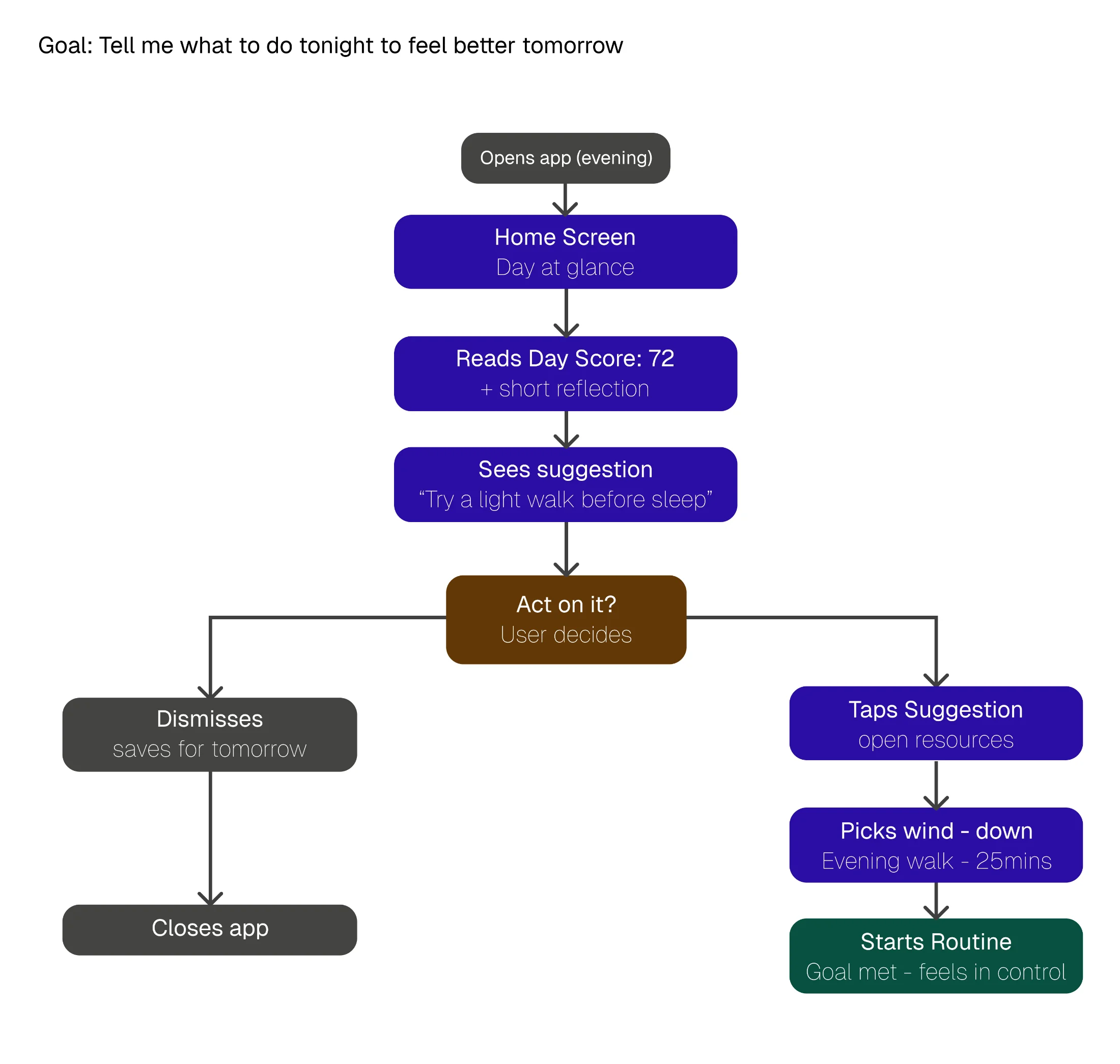
Task flow for Journey 01: open app in evening, home screen day at a glance, read Day Score 72, see suggestion to try a light walk, decide whether to act, then either dismiss (closes app) or tap suggestion, pick wind-down (evening walk 25mins), start routine with goal met
Journey 02

"Log something the device didn't track."

Manual entry, with a smart check for whether the wearable already caught it.
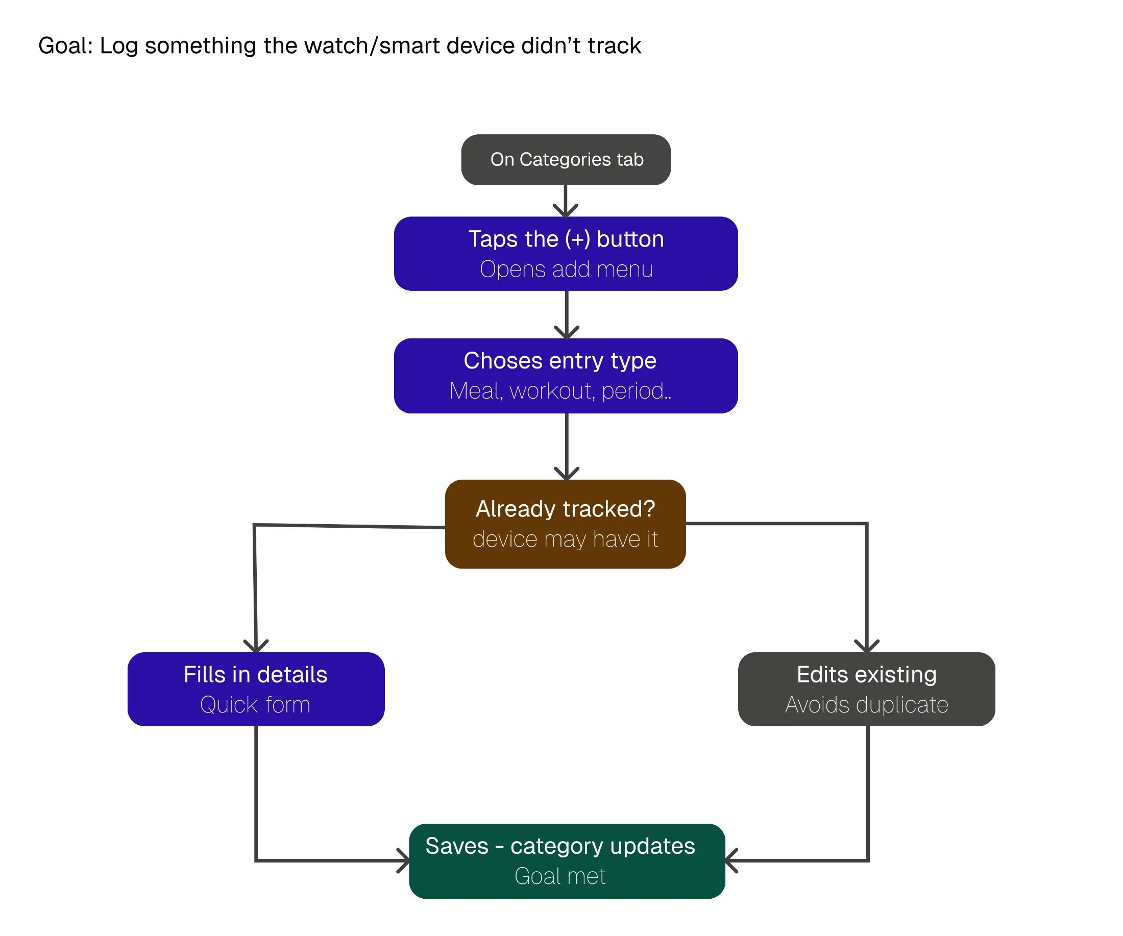
Task flow for Journey 02: on Categories tab, tap the plus button to open the add menu, choose entry type (meal, workout, period), check whether already tracked by the device, then either fill in details via quick form or edit existing entry to avoid duplicate, save with the category updating to meet the goal
Journey 03

"Get set up fast and see something useful."

Account, categories, optional device connect, straight to a first useful dashboard.
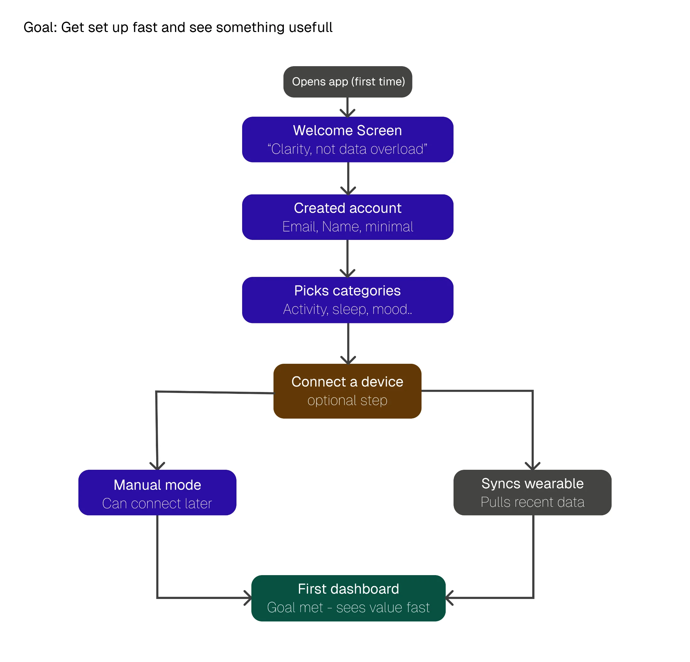
Task flow for Journey 03: open app first time, welcome screen 'Clarity not data overload', create account with email and name, pick categories (activity, sleep, mood), reach optional device-connect step, then either go to manual mode (can connect later) or sync wearable (pulls recent data), both paths land on first dashboard with the goal met
Why flows, not screens

Mapping by goal kept the design honest. A long or branchy path meant fixing the structure, not decorating the UI. The "already tracked?" check and the optional device step both came from spotting friction here.

§ 05 Structure + screens boxes before polish

The interface came from structure, not styling.

A site map fixed the architecture, then wireframes resolved the layout in greyscale, before any visual design went on top. Weak structure has nowhere to hide in boxes.

Information architecture

Five tabs, one persistent spine.

Everything hangs off a five-tab bottom nav: Home, Categories, Resources, Assistant, Settings. Categories holds all eleven trackable areas; the rest stay shallow.
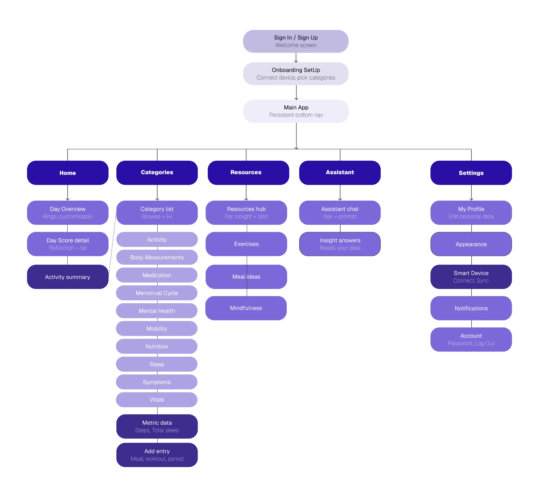
The NUMA site map: Sign In leads to Onboarding, then the Main App with a persistent bottom nav of Home, Categories, Resources, Assistant, and Settings. Each tab expands into its child screens, with Categories showing eleven trackable areas including Activity, Sleep, Vitals, and Nutrition.
Site map: 5-tab spine with Categories holding the eleven trackable areas.
Wireframes · low to mid fidelity

Four screens, resolved in greyscale first.

I worked the hardest layout decisions in grey first, with no colour or polish to lean on. Each screen went from a low-fidelity test to a mid-fidelity resolution.
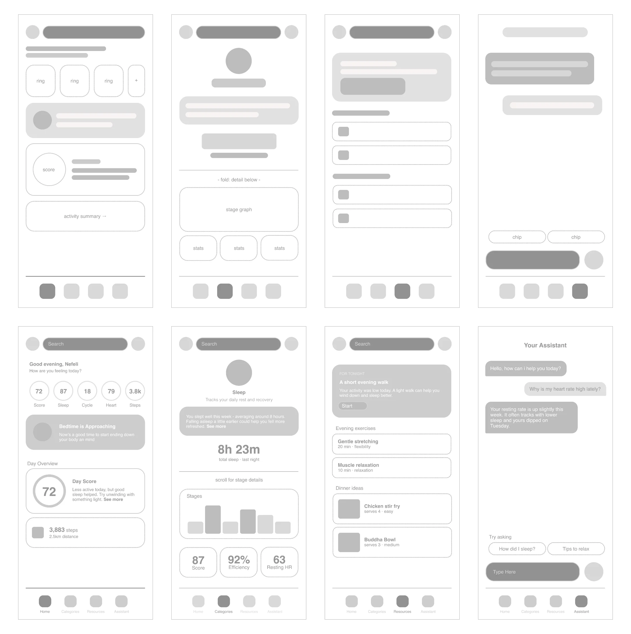
Two rows of wireframes for the Home, Sleep, Resources, and Assistant screens, shown from low-fidelity grey-box layouts to mid-fidelity resolved versions.
Four screens resolved in greyscale before colour: Home, Sleep, Resources, Assistant.
Home

Tested three rings versus five. Five won, made scrollable and customisable, turning a layout call into a personalisation feature.

Sleep

One clear number first. The total leads, the stage graph waits below the fold: "not data overload."

Resources

Lo-fi had choice paralysis from equal-weight lists. Mid-fi lifted one "For tonight" recommendation to the top.

Assistant

An empty chat read as intimidating, so prompt chips were added to show what the assistant can do.

§ 06 The interface in full colour

The product, resolved.

Minimal layouts, soft purple gradients, plain-language summaries, so the app feels supportive, not technical. Every screen stays quiet until asked for more.
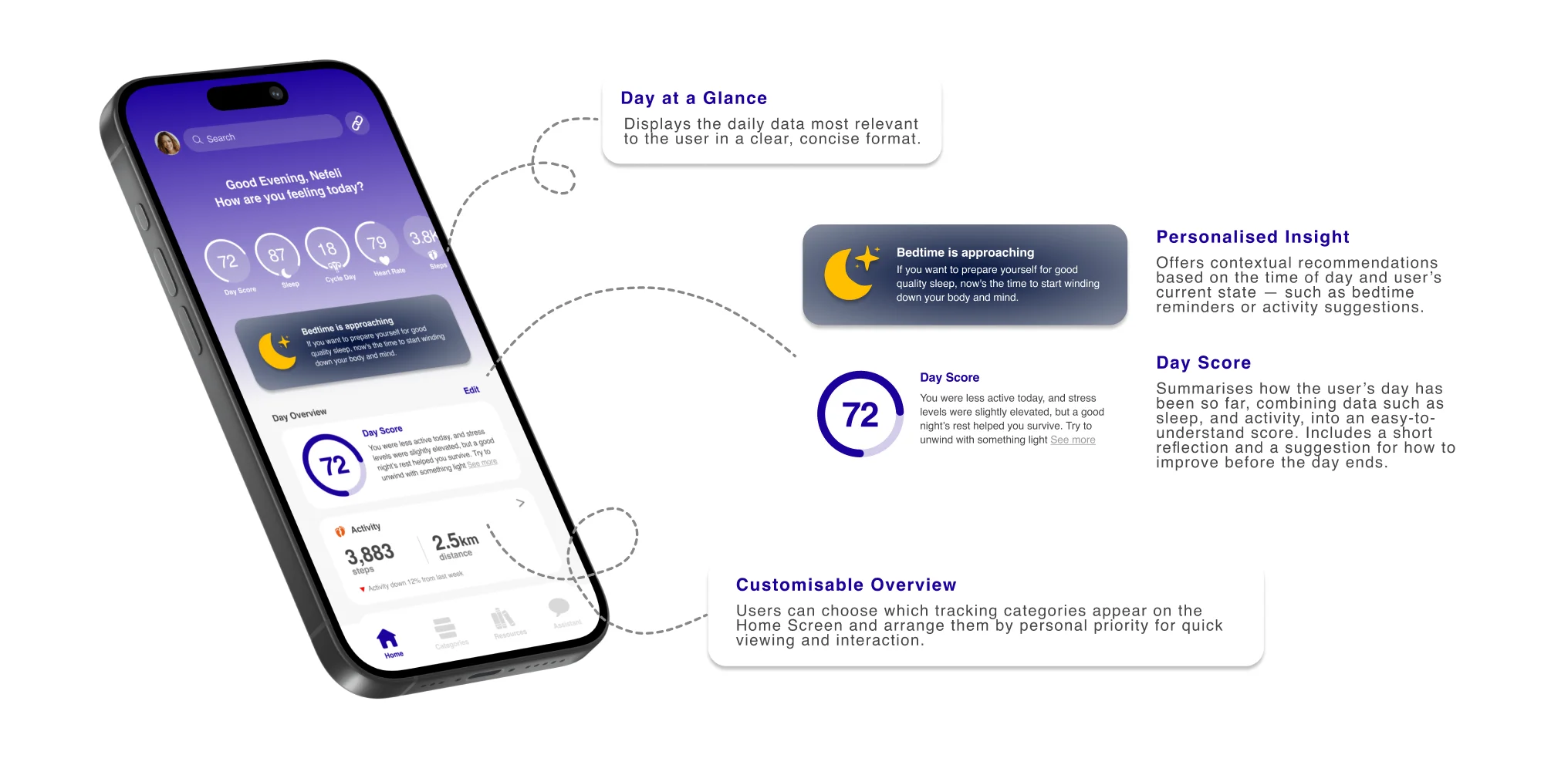
the home screen The NUMA home screen with annotations: Day at a Glance shows the day's key metrics, Personalised Insight offers a contextual bedtime nudge, the Day Score of 72 summarises the day with a short reflection, and a Customisable Overview lets users arrange categories by priority.
Annotated home screen: Day at a Glance, Personalised Insight, Day Score, Customisable Overview.
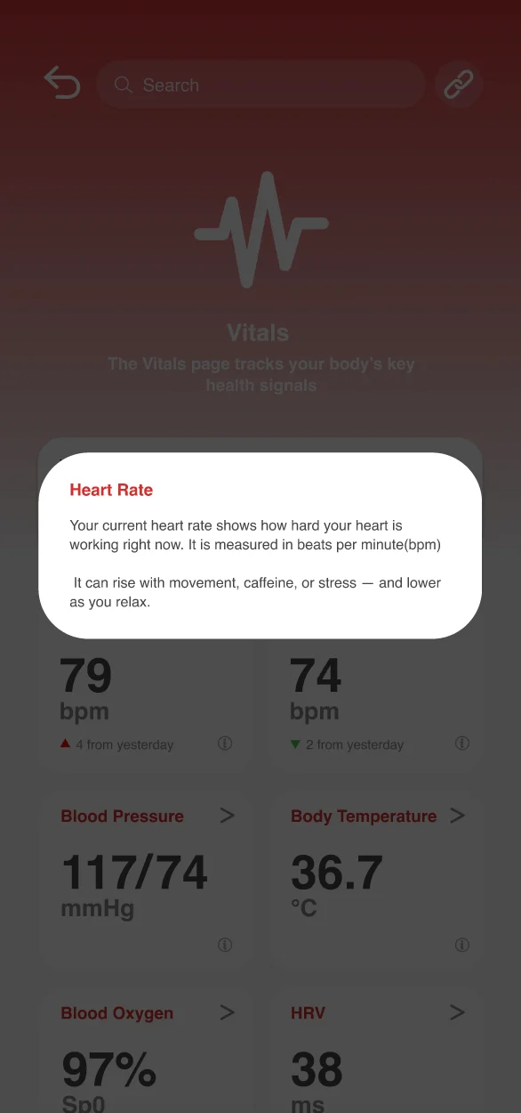
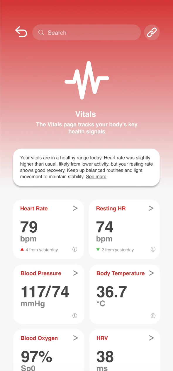
01 · Vitals
NUMA Vitals screen: heart rate, resting heart rate, blood pressure, body temperature, blood oxygen and HRV shown as one-number cards in a red palette.
Category overview. One number per card, colour-coded.
02 · Metric info
The Vitals screen with an information popup explaining what resting heart rate means and why it matters.
Tap any metric and it explains itself, so nothing feels opaque.
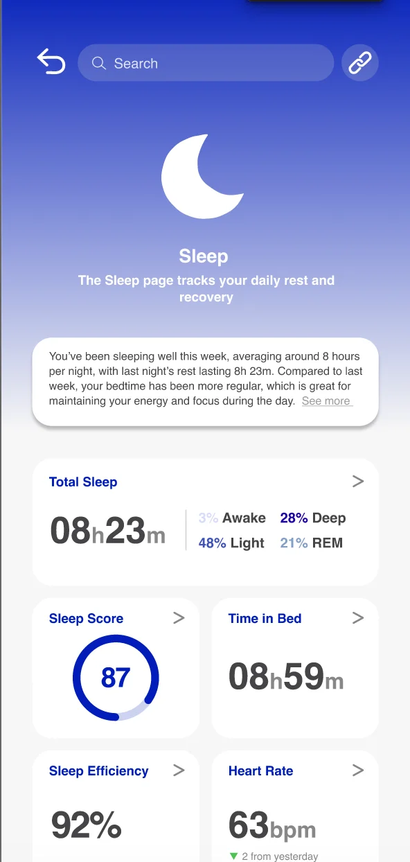
03 · Total sleep
NUMA Total Sleep detail screen: a large sleep duration, a stage graph, and a breakdown of REM, light and deep sleep.
Detail when wanted. The summary sits up top, the full breakdown a scroll away.
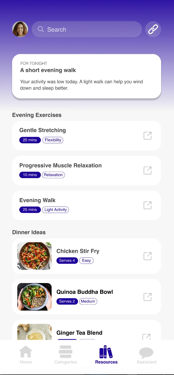
04 · Resources
NUMA Resources screen: evening exercises and dinner ideas suggested based on the day's data.
Actionable guidance. Insights become real next steps: stretches, meals.
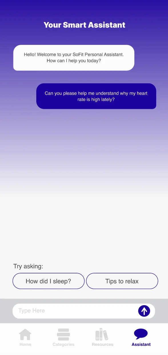
05 · Assistant
NUMA Assistant screen: a conversational AI answering a question about heart rate.
AI assistant. Clear, conversational answers that read the user's own data.
06 · Smart device
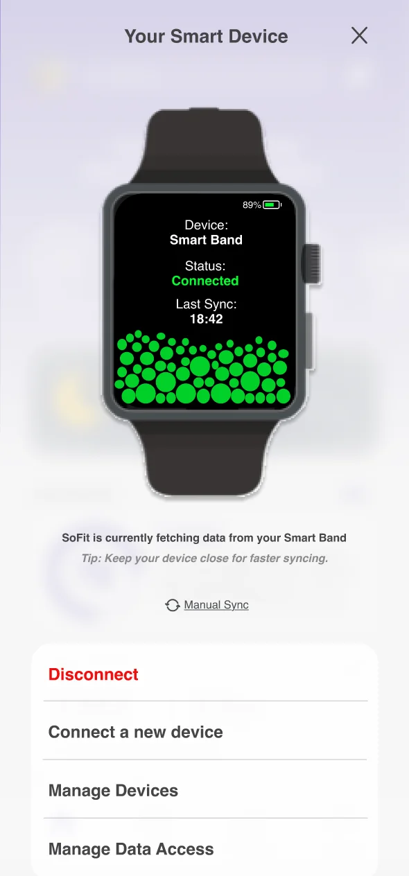
NUMA Smart Device screen: a connected smart band showing status, last sync time, and a live sync visualisation.
Wearable integration. Devices sync automatically, status at a glance.
Try the interactive prototype
§ 07 Brand find your flow

A name that means inner vitality.

NUMA comes from "numen", the inner life force, the spark of vitality. The brand reflects clarity, calm, and quiet sophistication: a deep purple that reads as both relaxing and rich, set in clean Helvetica, for a product about wellbeing rather than performance.
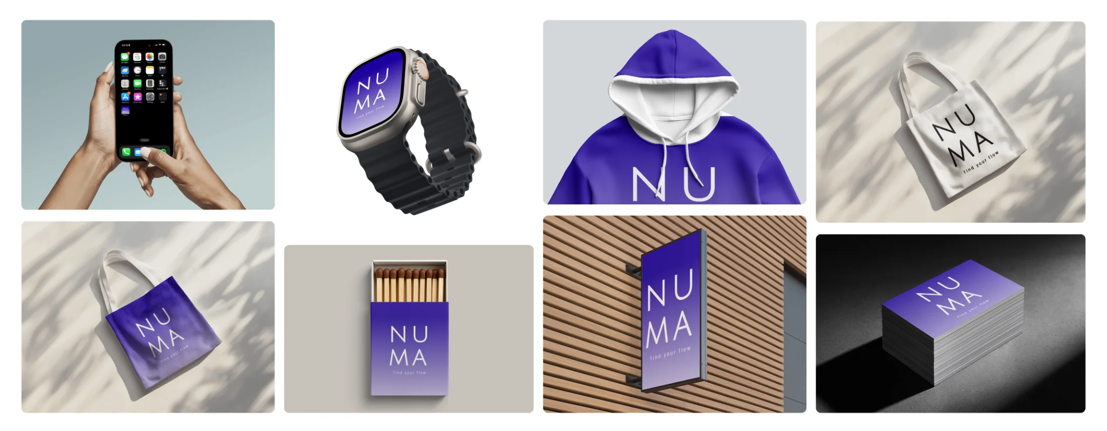
the whole system The NUMA brand moodboard: the app on a phone and a smart watch, a purple matchbox, and a purple tote bag with the NUMA logo, all in the brand's deep purple.
Brand applications: phone and smartwatch UI, tote, hoodie, matchbox, signage, business cards.
Colour palette
#1D009D Primary purple
#F0F0F0 Soft grey
#878787 Mid grey
#454547 Charcoal
Product font
Aa
Helvetica

A clean, neutral sans-serif. Familiar and modern, it keeps the interface quiet so the data and suggestions lead.